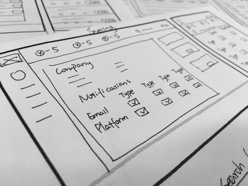
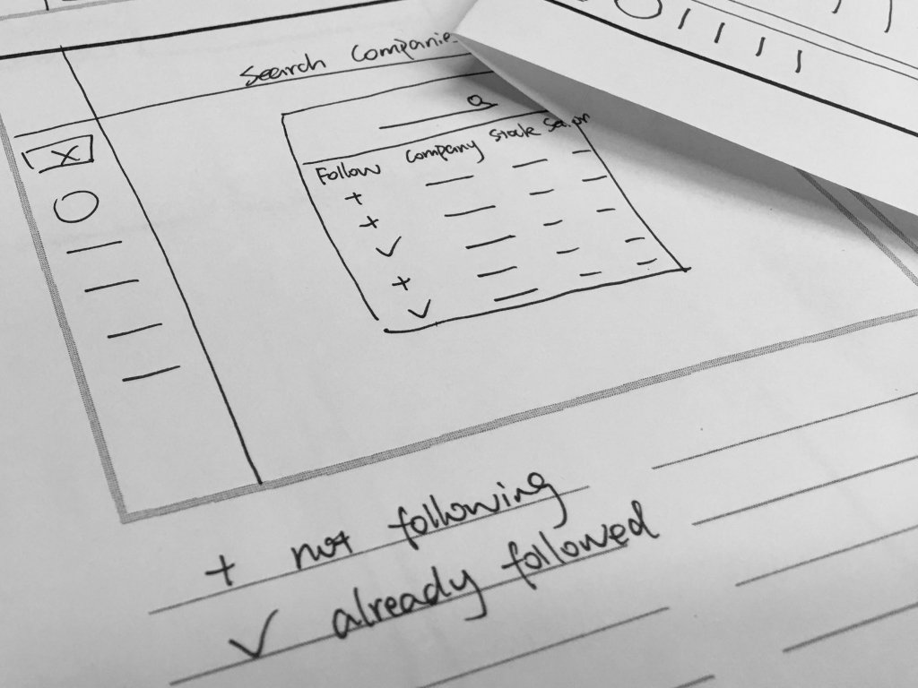
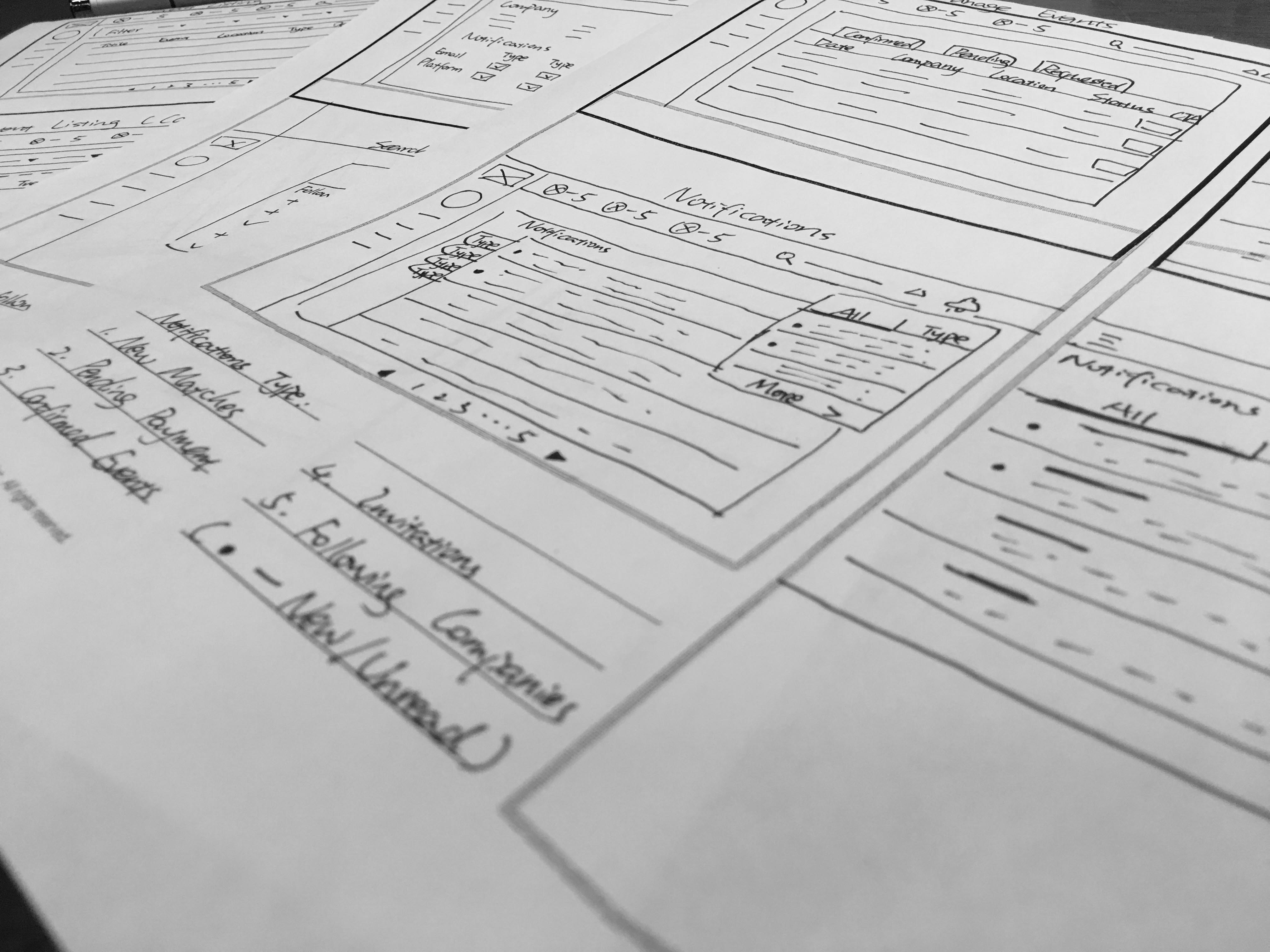
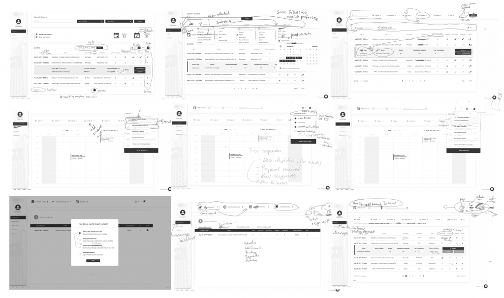
Corporate Access Platform

Design for both buyer and seller, desktop and mobile

My Role:

Chief Designer

Team:

Product and Engineering Team


Duration:

Five Months


This design project is for a new platform that offers corporate access, which in the financial field is a way for corporations and investors to meet in order to make investment decisions. The app I worked on would make corporate access more seamless, helping investors find matches with companies in certain industries and build connections with corporate executives who are responsible for investor relations.
 
Challenges for me:
1. Understand the niche market (“Corporate Access”) in a short period.
2. Add new features and restructure the information architecture for the entire platform.
3. Design for both buyer side and seller side, desktop and mobile.

Business Problem: the PM couldn't guide the engineers to develop the product he expected, in terms of UX and UI.

My Role

As Chief Designer, I was responsible for a variety of UX tasks, including: conducting user research and testing, restructuring the information architecture, and creating final prototypes for various features like UX and UI of search filters, dashboards and notifications. The design process lasts 4 months. I successfully helped the PM and engineers deliver a functional product to be presented to investors and gather feedback.

Design Process

Discover

I partnered with the PM to understand the users and market by analyzing the user research data, conducting user interview and competition analysis. 

Define

I reviewed the initial interface developed by developers, restructured the information architecture, and prioritized the features for design and launch.

Develop

I designed the interface for both buyer and seller, desktop and mobile, which are iterated based on internal discussion and testing, and also user testing.

Deliver

I used Zeplin to deliver the design and style guide to the engineering team, helped them debug and provided suggestions for the live version of platform.

User Problem: the traditional process of corporate access, with broker as middle man, is time-and-money-consuming and nontransparent.

Background:

For years, sell-side brokerage firms have arranged, for compensation, meetings between managers of publicly-traded corporations and institutional investors. This practice is commonly referred to as “corporate access“.  Brokers often charged investors, such as hedge fund and mutual fund mangagers, up to $20,000 for such meetings. (NYLJ)

These meeting has many types, while for the most part, can be divided into three categories. 1 – Investor Conference, where corporate management is invited to make presentations to a large number of analysts and investors. 2 – Smaller Group Meetings, typically arranged by broker-dealers for a select group of investor clients, perhaps as part of a targeted investment strategy or a tour of a specific geographic region. 3 – One-on-One Meetings (brokers facilitate) between investors and corporate management, which can take place at the investors’ offices, on site at the company, or a “breakout” sessions at conferences. (NYLJ)

No matter for corporation or investor, the traditional process, with broker as middle man, is time-and-money-consuming and nontransparent. To build a platform replacing the middle man, the challenges are how to present all the information in a simple way, make the process seamless and get professionals use the platform. 

Challenges: present all the information in a simple way, make the process seamless, and get professionals use the platform.

Understanding the goals

Business goals and user goals

Business goals: The startup I was working for was trying to validate that corporate access is a real problem for investors and corporate executes, such that a platform was needed. They need to build a working platform and pitch that to investors.

User goals: To remove the middle man, which would traditionally be the broker between corporate executes and investors, and instead provide direct access to arrange investor relation meetings. Overall, this would lower the costs involved in the entire corporate the corporate investment process.

User Research

To inform the design process, I conducted a mix of primary and secondary research. The primary research surveyed 30+ corporate executives on the biggest pain points of the investor relations process.

The product manager identified “investor targeting“, “getting time with quality investors“, and “administrative aspects of scheduling meetings” as the major pain points that the product aims to solve in this early stage.

User Persona

I created two user personas (for both seller and buyer) based on our own user research results, and several published interviews, news report, and industry reports from authoritative media, such as IR Magazine and NASDAQ news.

Buyer (Investor)

User Persona - Buyer Side (Investor) - Elise Fu

Seller (Corporate)

User Persona - Seller Side (Company) - Elise Fu

Wireframe

We brainstormed and drew on paper to ideate the best practices. The desktop and mobile versions are separated but they are designed at the same time. After reaching agreements with the PM on paper, I started creating digital prototypes.

Internal Testing and Iteration

It took me and the PM four months to ideate, iterate and finalize the design. We evaluated the design and detail each time by considering users’ need and behavior, also conducted user testing to testify the learnability and usability of the interface with the target audience, whose feedbacks were adopted in the future iteration.

Design Iteration

INFORMATION ARCHITECTURE - Buyer Side

IA - Buyer Side - Elise Fu

Design - FOR BUYER – EVENT LISTING​

This is one of the most essential interfaces for the platform, where buyers can browse, filter, and search events. In the list, users can see the basic information of the event, and the status (e.g. whether they have submitted a request, or the request has been approved, etc.). They can open the dropdown to check the event details.

UX Project - Search List - Elise Fu
UX Project - Filters- Elise Fu

Design - FOR BUYER – CALENDAR VIEW​

Besides list view, we also offer a calendar view for users to check events, and use a pop-up window to display event details.

UX Project - Calendar View - Elise Fu
UX Project - Mobile Calendar - Elise Fu

Design - FOR BUYER – Notifications

User can use the bell icon at the top right corner of the page, where displays the number of unread notification, or select the tab from sidebar to access notifications. All notifications are classified into 6 categorized, so users can find the information they want quickly, while they can still choose to view all notification at the same time.

UX Project - Notifications - Elise Fu
UX Project - Mobile Notifications - Elise Fu

Design - FOR BUYER – Manage Events

This is the dashboard for users to manage the events they have requested attendance (“Requested Events”), event request being approved and need to make a payment(“Pending Payment”), and paid events (“Confirmed Events”). For different status, users can make different actions accordingly, such as make a payment or add to calendar. Since “Pending Payment” is an urgent action user need to take, so we add a icon at the top right corner showing the number of pending payment to remind user.

UX Project - Manage Events - Elise Fu
UX Project-Manage Events-Elise Fu

INFORMATION ARCHITECTURE - Seller Side

IA - Seller Side - Elise Fu

Design - FOR seller - Manage Events

This is the dashboard for sellers to manage their events, such as process/remove the request and send reminders.

UX Project-Desktop-Manage Events-Elise Fu
UX Project-Mobile-Manage Events-Elise Fu

Design - FOR seller - Invite Buyer (Investor)

After sellers post their events, they can send invitations to selected buyers on the platform, or import from their own contact list. When importing contact list, the system will identify who are already on the platform and who aren’t. For those who aren’t, the system will send an email to invite them to join the platform and check the event automatically. For those already are on the platform, the system will only send invitations.

UX Project-Desktop-Invite Investors-Elise Fu
UX Project-Mobile-Invite Investors-Elise Fu

Implementation

After finalizing the design, I used Zeplin to deliver the spec to the engineering team, helping them increase the efficiency of building the front-end. I also tested the live version of the interfaces after the team built it and provided suggestions to fix some minor usability issues.

Implement Design
Implement Design
Color Palette
Implement-corporate dashboard
implement-investors dashboard

User Testing

I conducted three user testing for the interface of buyer side with the clickable prototype. The first testing was conducted in the middle of the design process, with Vineet who from the investment industry. He gave the design a high evaluation, as well as some minor suggestions. His feedbacks are taken and integrated into the current design.

After the design process was finished, I conducted the testing again with two non-financial users to see whether it is understandable for the broader user base. Both of them completed the takes without any extra considerations and reviewed the interface is very easy to understand. They also provided valuable feedback which I will take into consideration for the next iteration. I am also planning to conduct user testing for the interface of seller side.

Usability Testing-Feedbacks and Suggestions

Team Feedback

Conclusion & Learning

This is my first B2B UX project. I design the interfaces for both seller and buyer, also for both desktop and mobile. The complicated structure and the intensive process make it a great learning and practice for me.

One of the biggest challenges of the project is to understand the business. Corporate Acess is a niche market in the finance industry, which has a different conceptual model with regular event booking business. I’m glad I have been able to leverage research and user journey mapping to understand it and successfully revamped the project, even when the tasks turning to be more and more complicated. Because my role for this project actually expanded after the first few design iteration (I was only tasked to redesign the search list at the beginning).

User testing is another part of the projects that I learned a lot. No matter how good the skill is, designers should always go out and talk to other people, so that we can avoid as many blind spots as we can. I’m planning to conduct more user testing and perfect the design when going forward and looking forward to making the product one of the best in its categories.

View Other work