Research, design, and user testing for the new product
My Role:
Product Designer
Teammate:
PM + Engineering Team
Duration:
Two Months (ongoing)
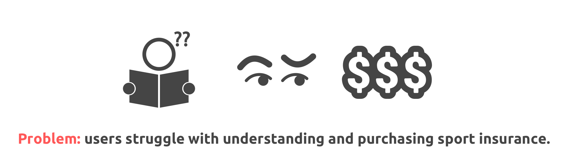
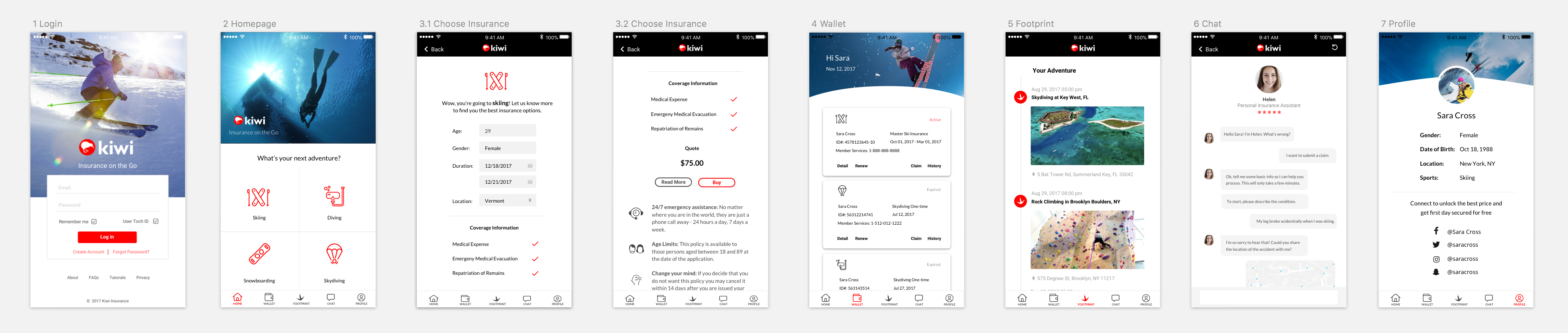
Kiwi is a mobile app that helps people purchase sport insurance and live more adventurously. I worked with a product team to design the product from idea to clickable prototype. This involved research, user testing, multiple design iterations and collaboration with engineerings.
Challenge for me: designing a product from scratch in an area that I wasn’t familiar with.
(Update: according to the latest remote user testing, 66% of participants said they would actually use the app and recommend it to friends when it is developed. The CEO is very happy with the result.)
Background
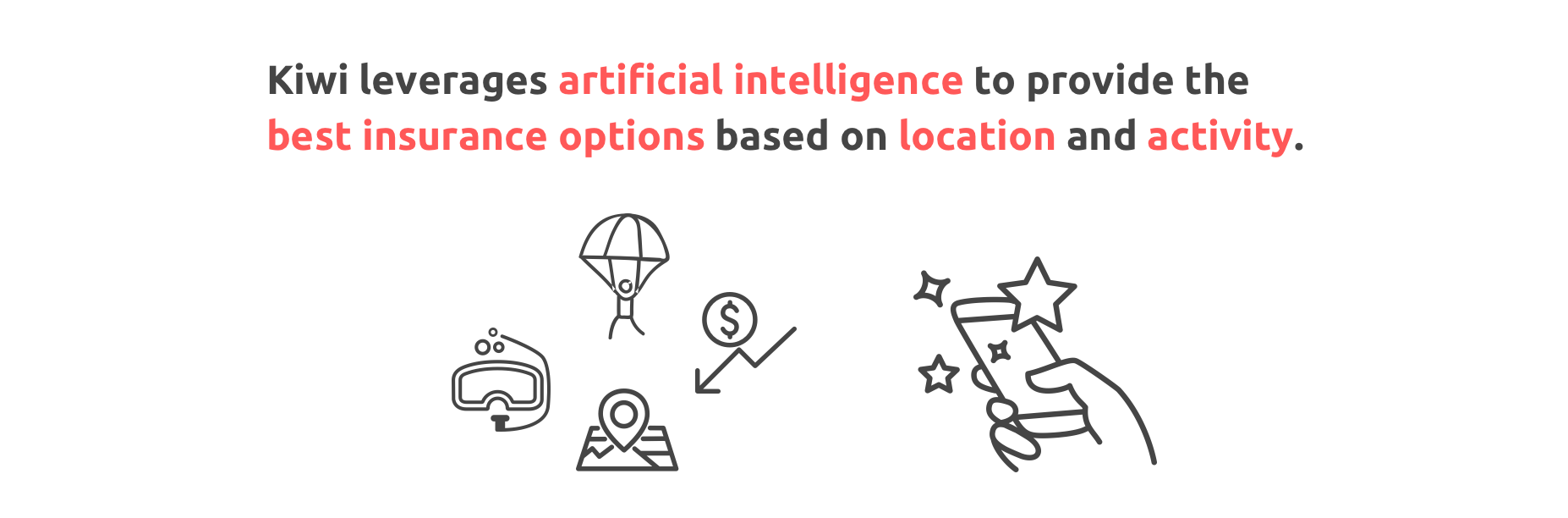
We started the project with a hypothesis that sports enthusiasts who participate in risky physical activities don’t have a user friendly way to evaluate and purchase insurance. Kiwi solves this by providing on-the-go insurance that leverages AI and chatbot technology to streamline the purchase & claims process for sport insurance, which are currently not available in this industry.
I also did some market research to understand the industry: “Sport insurance is part of travel insurance industry, which provides trip protection, personal effects protection, emergency medical coverage and other types of specialized coverage for travel risks. The industry revenue increase at an annualized 3.0% to $3.1 billion in 2016” (IBISWorld).
Research: Online Survey
To verify our hypothesis and due to limited resources, I decided to conduct an online survey to understand user pain points. I developed my own screener and identified several Facebook sport-related groups where I can reach the target users.
The survey involves 15 questions, focusing on customers’ purchasing behaviors. Since the app aims to incorporate some social media features, questions regarding social media usage were also included.
Price, ambiguity, distrust and lack of clearly available options are major pain points of the insurance purchasing process.
From the survey, we discovered that:
Major users are male (72.2%) between the ages of 18-29 (50%).
Facebook (41.2%) and Instagram (47.1%)are the most commonly-used social media
Most people (58.8%) post their sport activities after the activities instead of before and during
Most people (58.8%) are open to purchase episodic insurance
Users strongly prefer insurance to be priced between $1-$15 per day
The deciding factor for most customers looking to buy insurance is the total amount of coverage
People want an easy way to buy and manage insurances which really benefit them.
We also gathered some valuable insights from open-ended questions:
“I want a sliding scale of cost.”
“Expect to see fair price and good coverage.”
“Want to see outlined costs and benefits.”
“It will be great if it can combine many data items, like IOT.”
“Want to have notifications/reminders of caps.”
“Ease to use, and clarity about what is covered would be very important. I am honestly not sure what I would pay, but I think it depends on the sport and level of risk I feel I am taking. I go mountain biking, kite boarding, rock climbing, and other things, and I think it would sometimes be a hassle to get a new insurance every day I do something.”
Design Iteration 1
Quick Prototype and User Interivew
After the survey, PM and I brainstormed product features, including how to present the insurance options, how to provide customer services, and some interesting functions aiming to keep users on the app and differentiate the product from competitors.
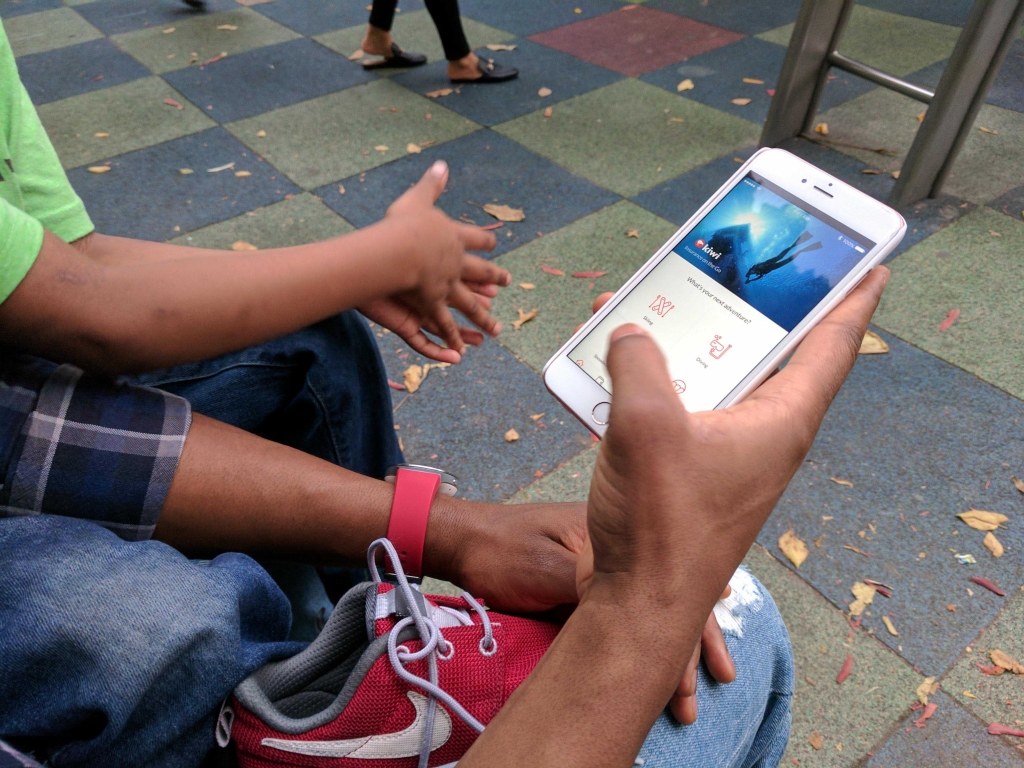
Since it is a consumer-facing app, we want to involve user insights as early as possible. So before diving into developing the complete user flow for all the features, we decided to create a basic prototype (as simple as just showing the basic features), bring it to potential users and interview them to gather first-hand insights for future iteration.
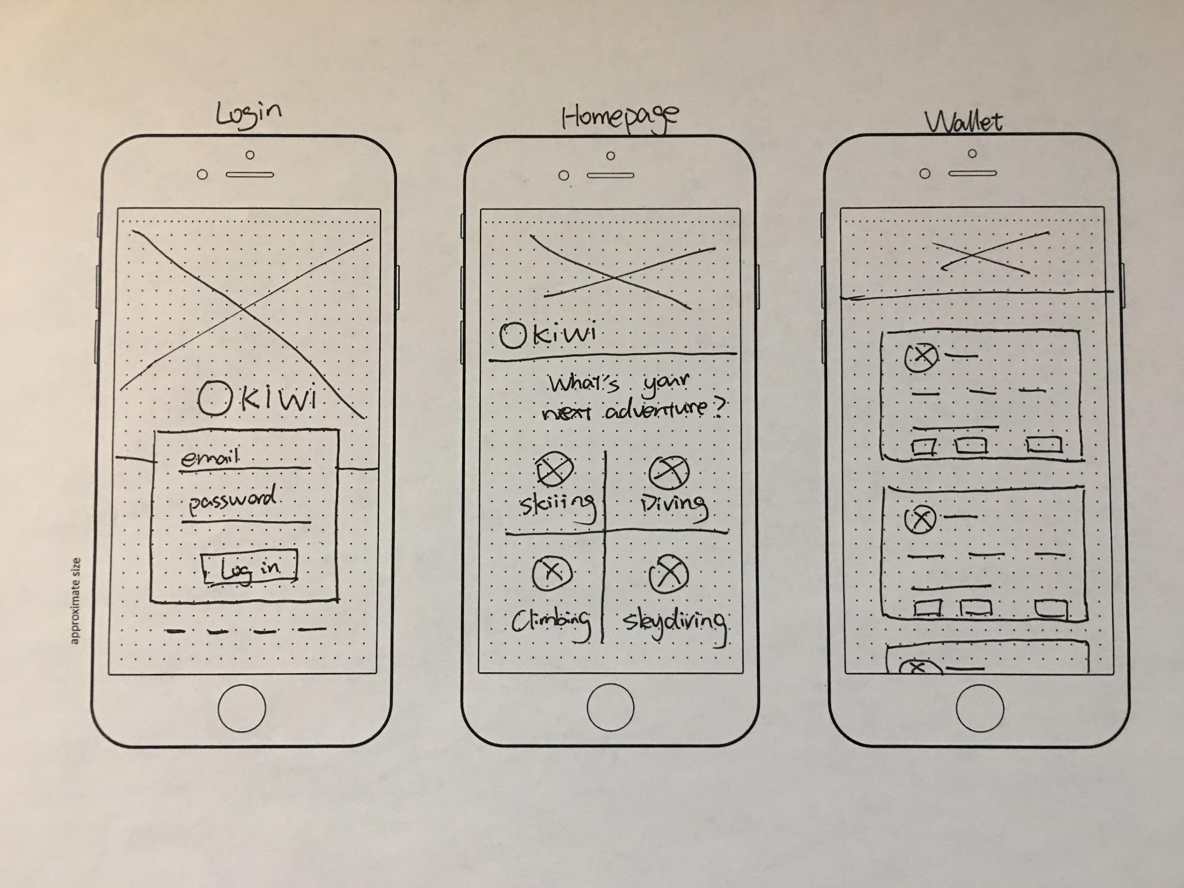
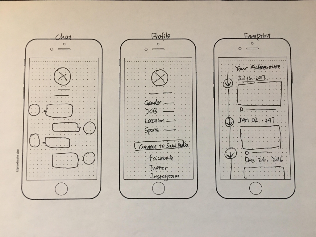
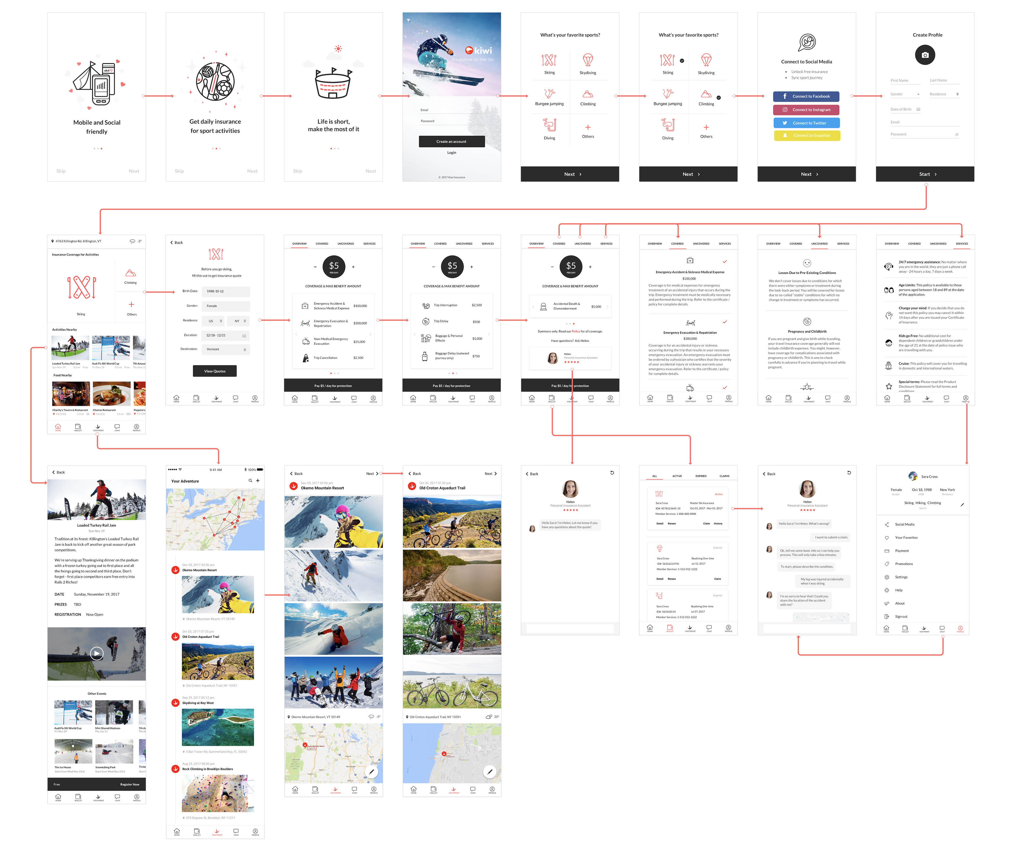
I first drew wireframes on paper, then turned them into high fidelity versions in Sketch, and finally used InVision to build the clickable prototype.
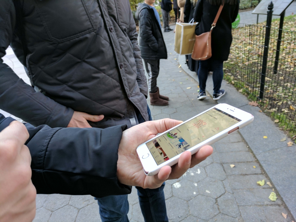
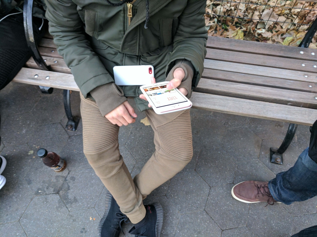
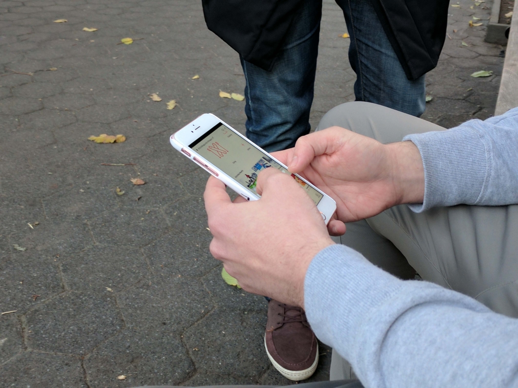
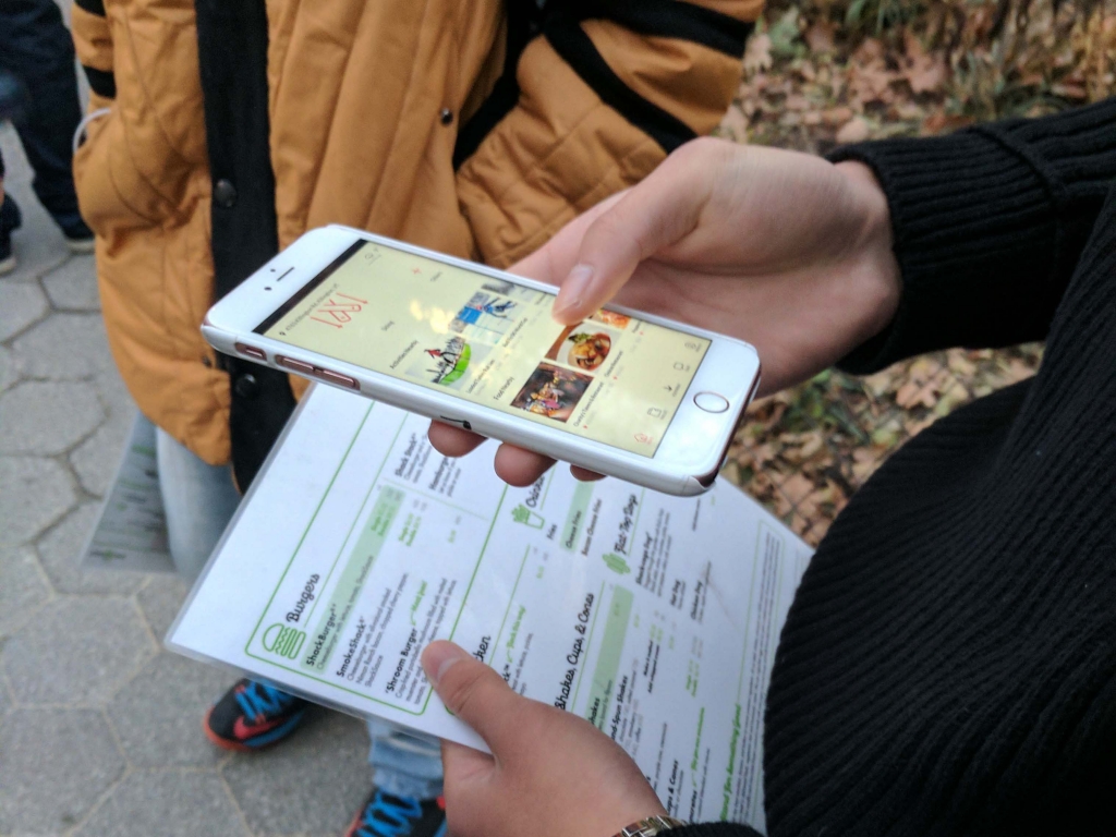
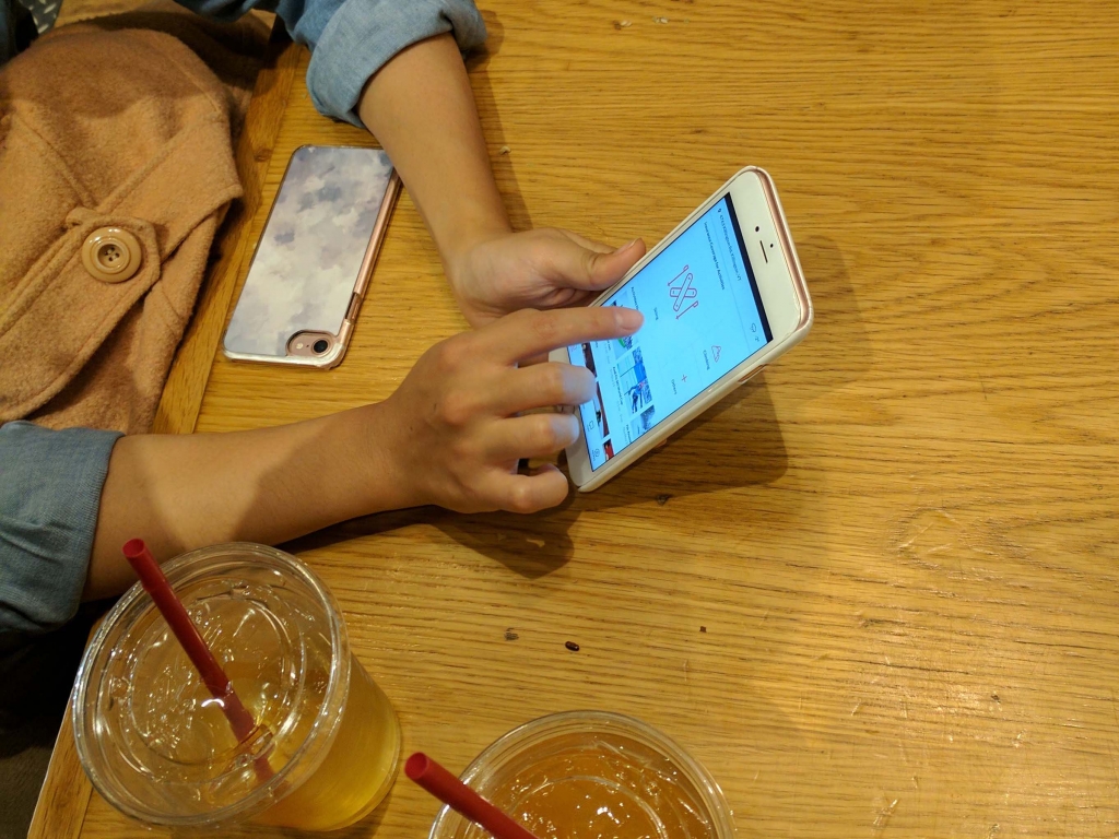
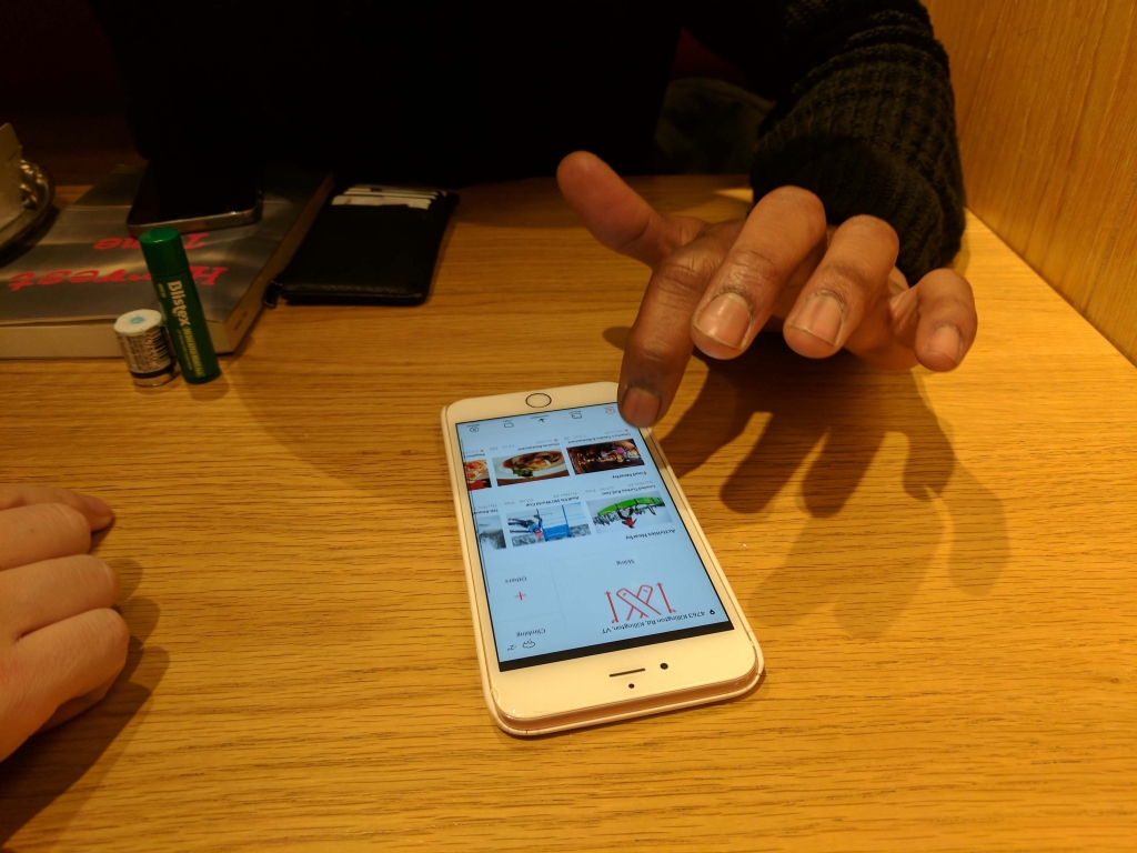
We approached customers at an athletic equipment store and talked to them about insurance.
6 people (4 male / 2 female) agreed to be interviewed. Most of them loved the idea and the prototype. They like how the interface looked, and liked the “Footprint” feature which tracked and recorded their journey. Users also said they would use the chatbot to submit claims and ask questions before purchase.
They shared their biggest pain of purchasing insurance was not knowing what’s covered vs not covered as part of sport insurance. The finding leads to our future iteration which includes different tabs explaining both the covered and uncovered circumstance.
Interviewees’ biggest worry: “what’s covered and not covered?”
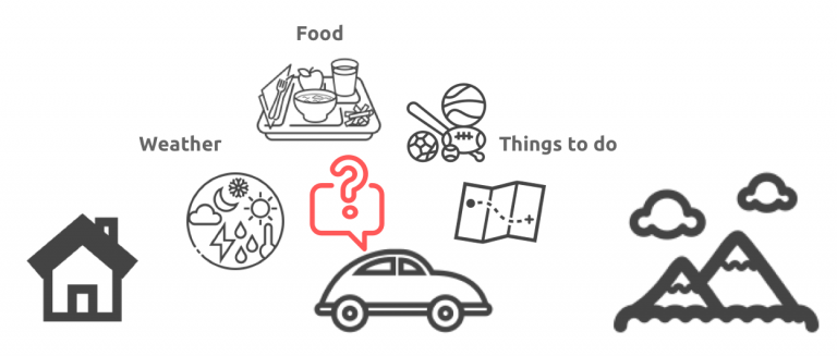
Another insight was that users expressed a desire for the app to consider their entire journey of sports activities. They provided feedback that the app should include local information like weather, food and activities nearby the venues.
Users also expressed how seeing local information (e.g. weather, food, activities) could enhance their sports-going activity. This presented an opportunity for Kiwi to be a more integrated experience that goes beyond just insurance.
Design Iteration 2
Explore
User feedback informed me that Kiwi can be a “stickier” app if positioned as a lifestyle app which happens to sell insurance for related activities seamlessly.
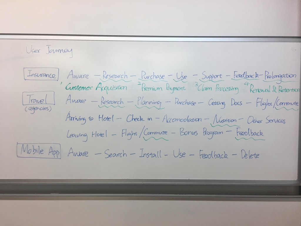
Because no other app integrates these different experiences in one, I analyzed the user journeys of travel agencies and the traditional insurance purchase process.
User Journey of Insurance and Travel Agencies
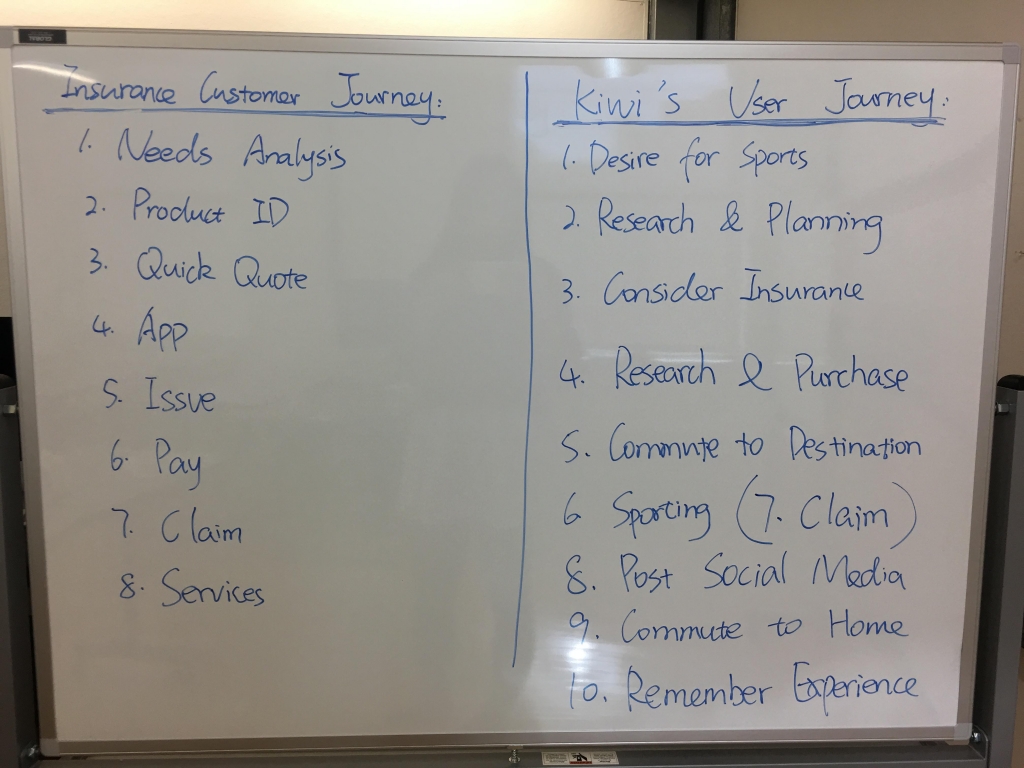
Insurance Customer Journey & Kiwi User Journey
Brainstorming major features
Wireframing
User Flow
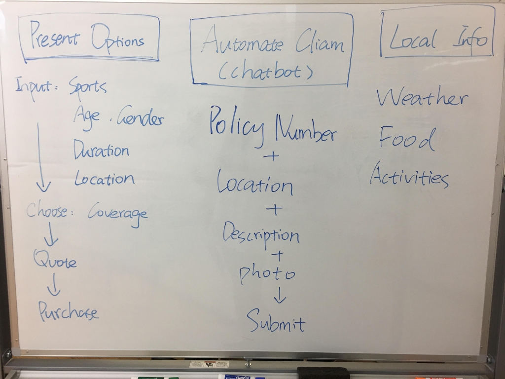
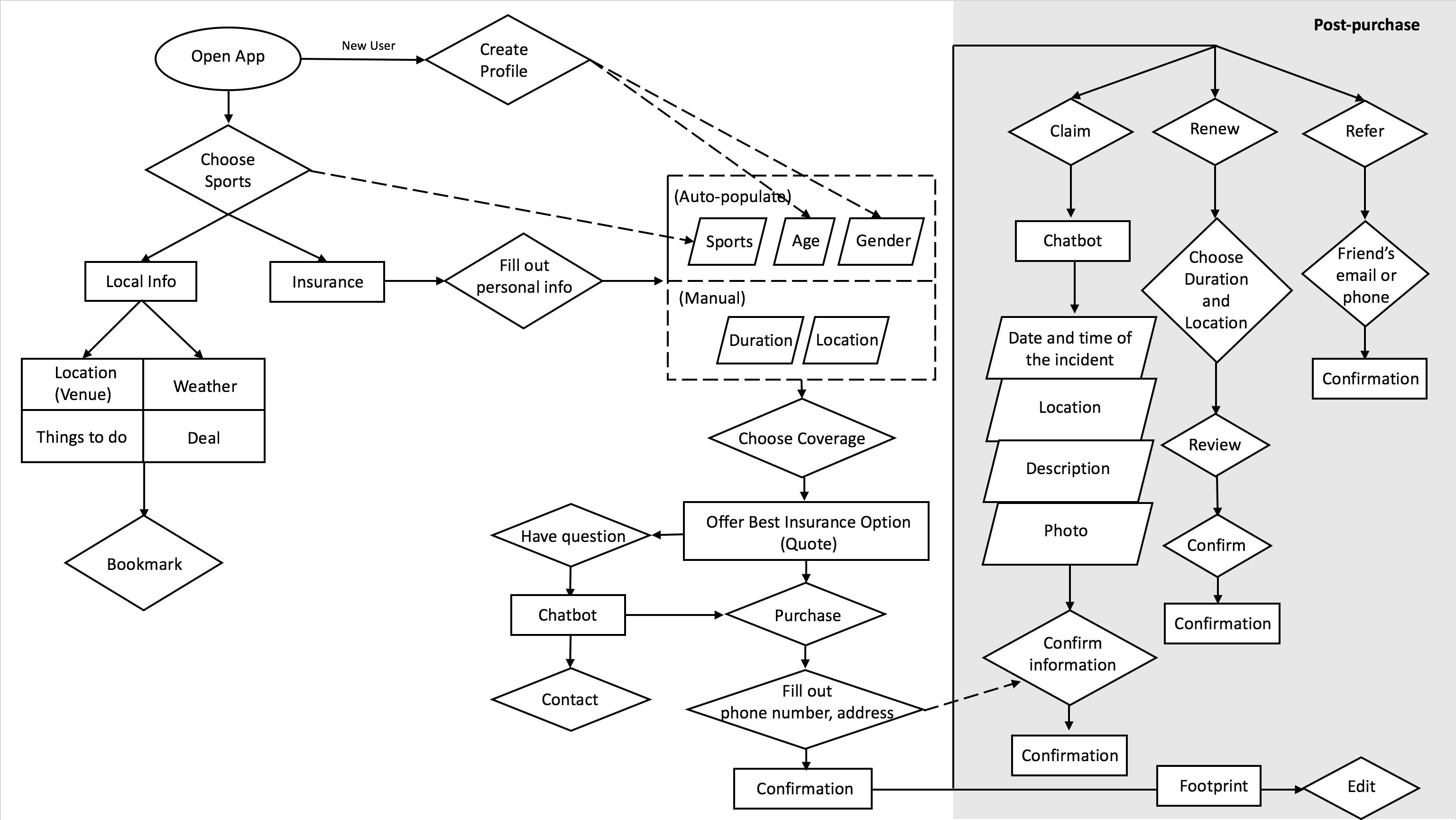
Based on the results of brainstorming, I created a user flow diagram to determine the most necessary features. Receiving from feedback from PM, I made two changes of the flow.
First Draft of User Flow
Notes for Editing the Draft
Instead of requiring user to choose sports first, using the data of location service to guess what they are going for.
Change 1: In the first draft, we placed “choose sports” before local info. After discussions, we decided to move the local info up one level because we can recommend the sports based on location first, and then let users choose when purchasing insurance. For example, the most popular sports in Vermont during wintertime are skiing and snowboarding. Instead of having users go through the trouble of choosing one sport out of hundreds, we would leverage AI to predict the most likely sports activities users are interested in. Additionally, the app home screen will automatically adjust to the user’s location, displaying relevant local info without users having to dig up the information themselves.
Show the quote first, and then allow users to make adjustment.
Change 2: In the first draft, we placed “choose coverage” before “quote”. To make it more convenient for users, we prioritized the quote first, then allowed for users to adjust their coverage and price.
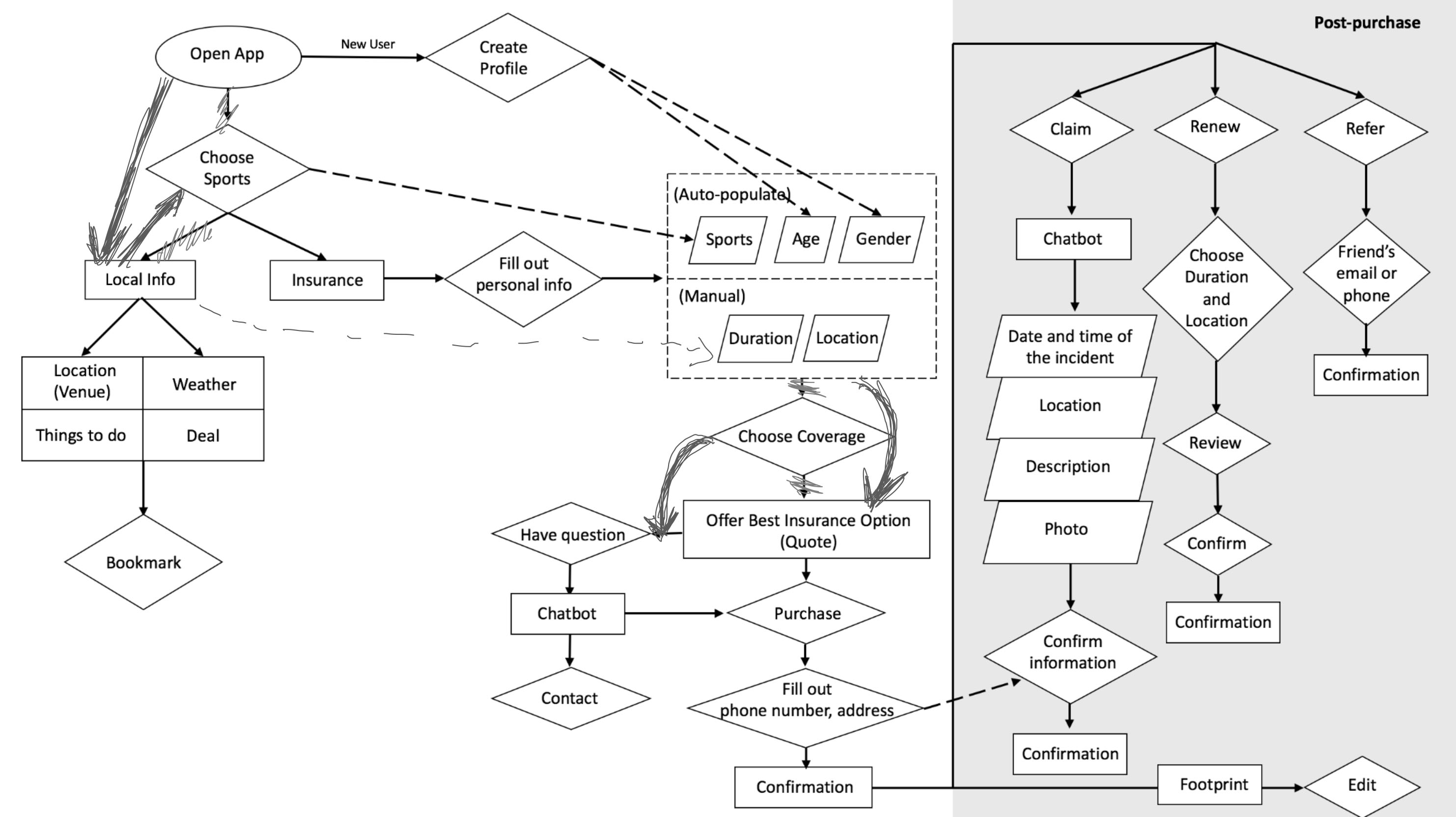
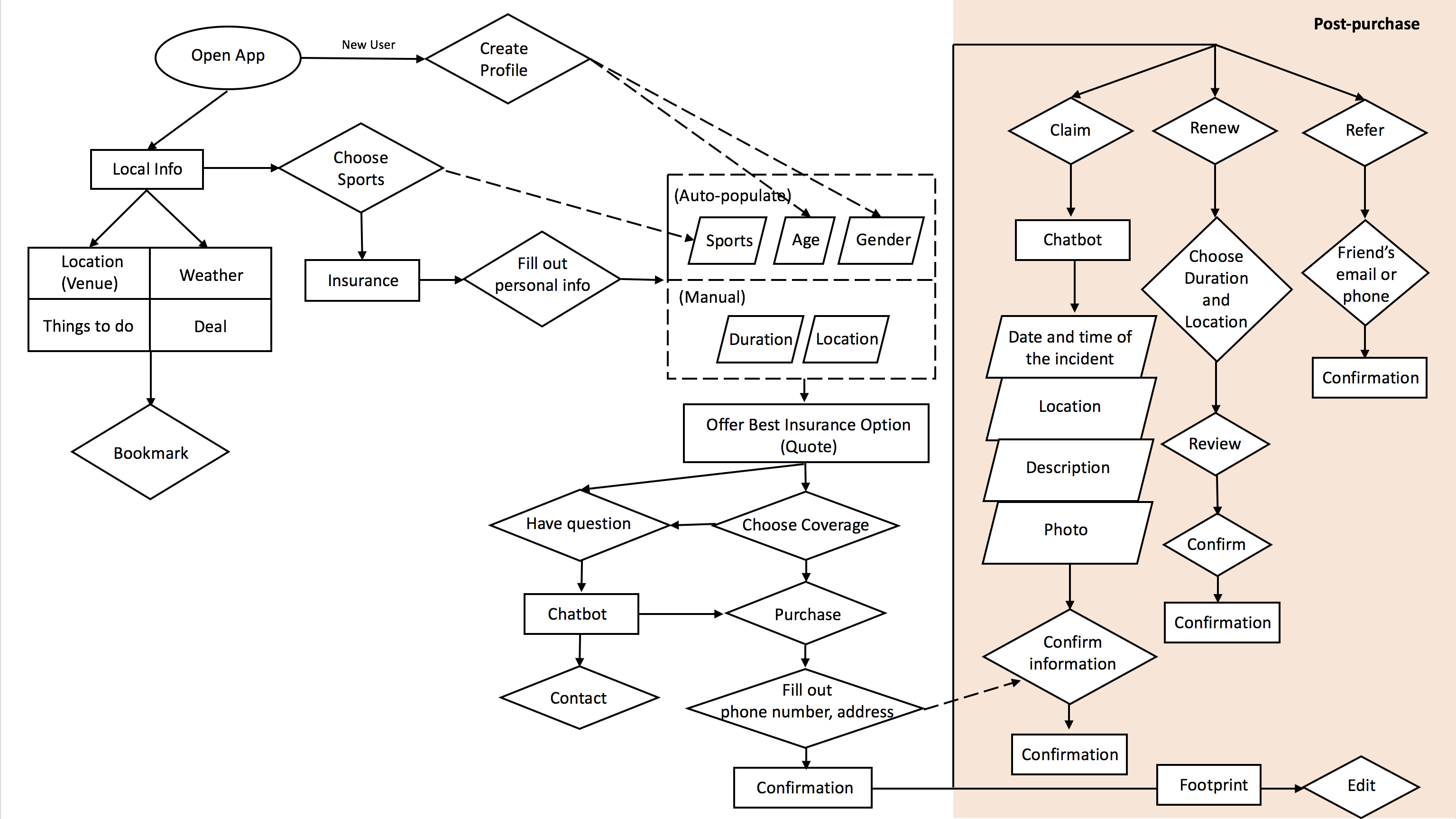
Updated User Flow
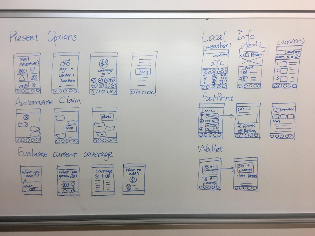
Wireframe
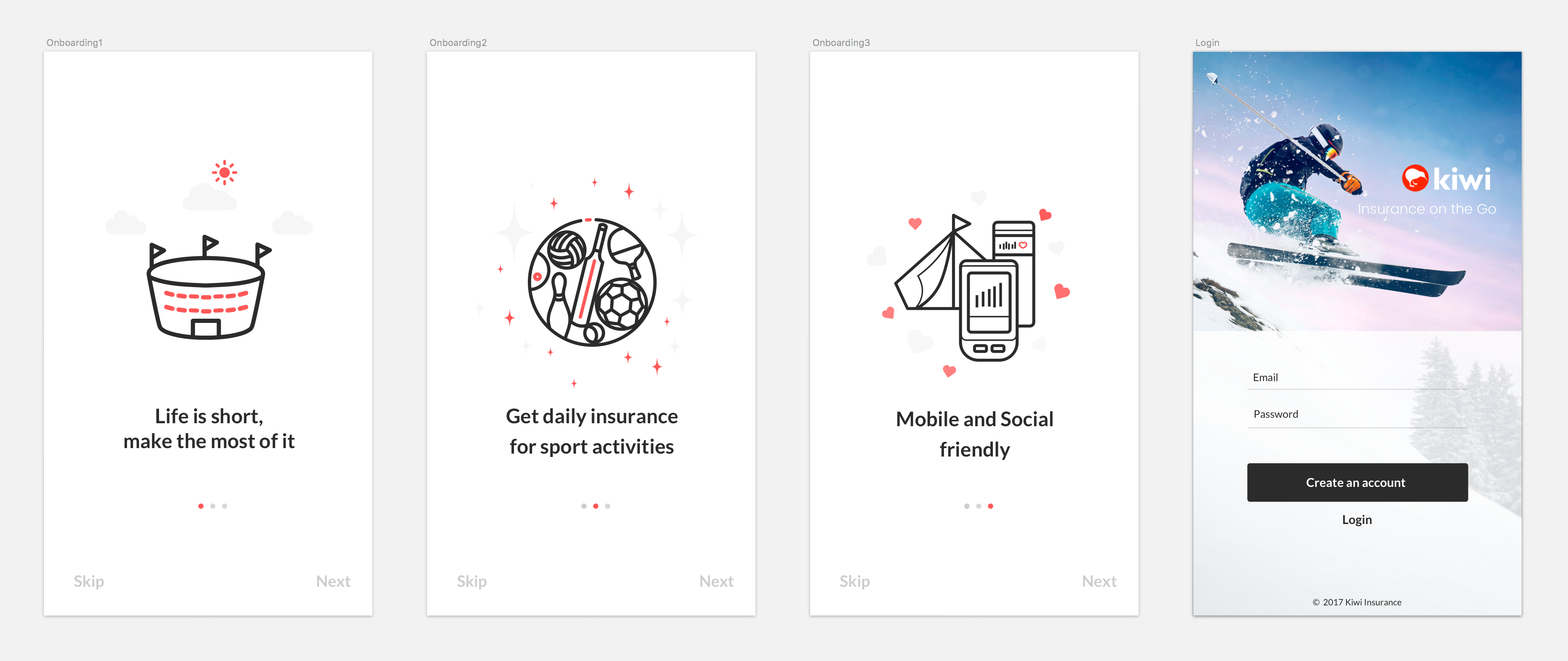
After deciding the user flow, I drew on paper to wireframes the major features in the user flow: the onboarding process for new users, homepage, and the insurance quote. I switched to Sketch to create high-fidelity screens after the process.
Wireframe for Onboarding
Wireframe for Onboarding and Homepage
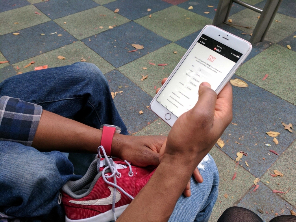
Wireframe for Insurance Quote
Design: Onboarding
The onboarding process for new users will have two phases:
Before Login: we designed to use three screens to introduce what Kiwi is. The images on the screens will be redesigned in the future. Now we are testing whether the messages are clear enough. (Based on a later user testing, the credibility of the insurance issuers is one of user’s major concerns, so we are planning to add the partners on the onboading screens in next iteration.)
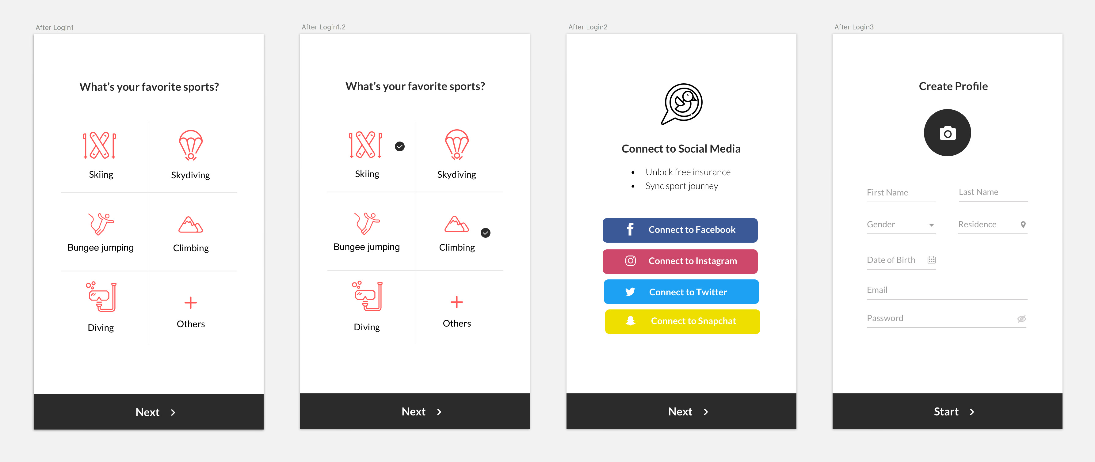
After Login: favorite sports, social media, and basic information required for insurance purchasing are the key information we want from users, so we designed to collect them after creating account, while before accessing the homepage.
Before Login
After Login
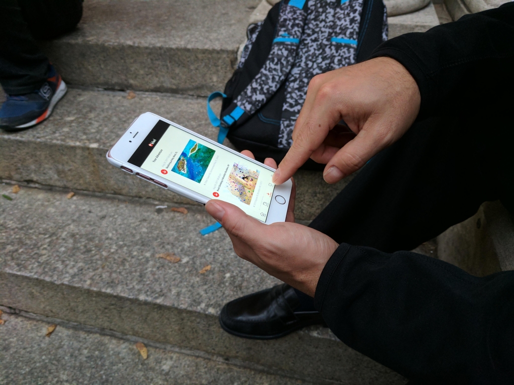
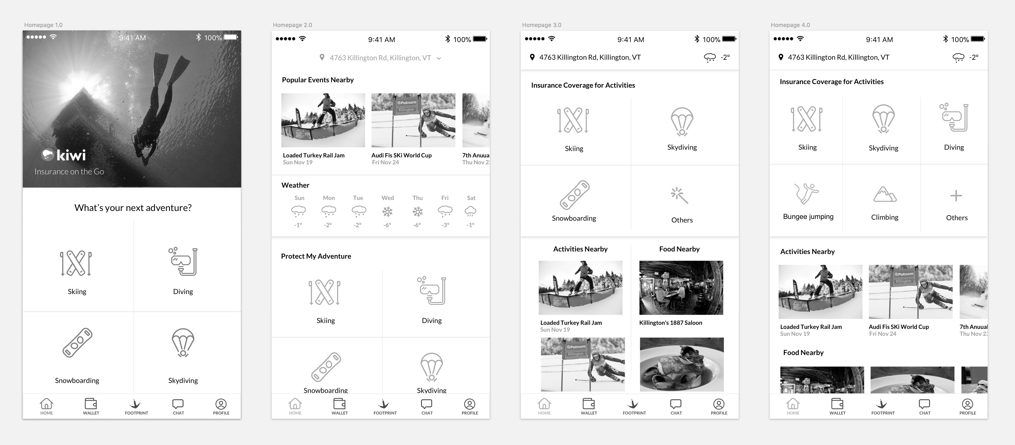
Design: ITERATION OF HOMEPAGE
I designed multiple iterations for the homepage, starting from a version that focused just on insurance, and finally landed on another version that included local information.
Before
After discussions, we decided to keep the insurance info on top of local info, because purchasing insurance is the core feature of the app, and use the horizontally scrolling for the activities and food nearby.
We limited the number of sports options on the homepage because the app will estimate the most likely sports available in users’ location. This keeps the interface simple and clean.
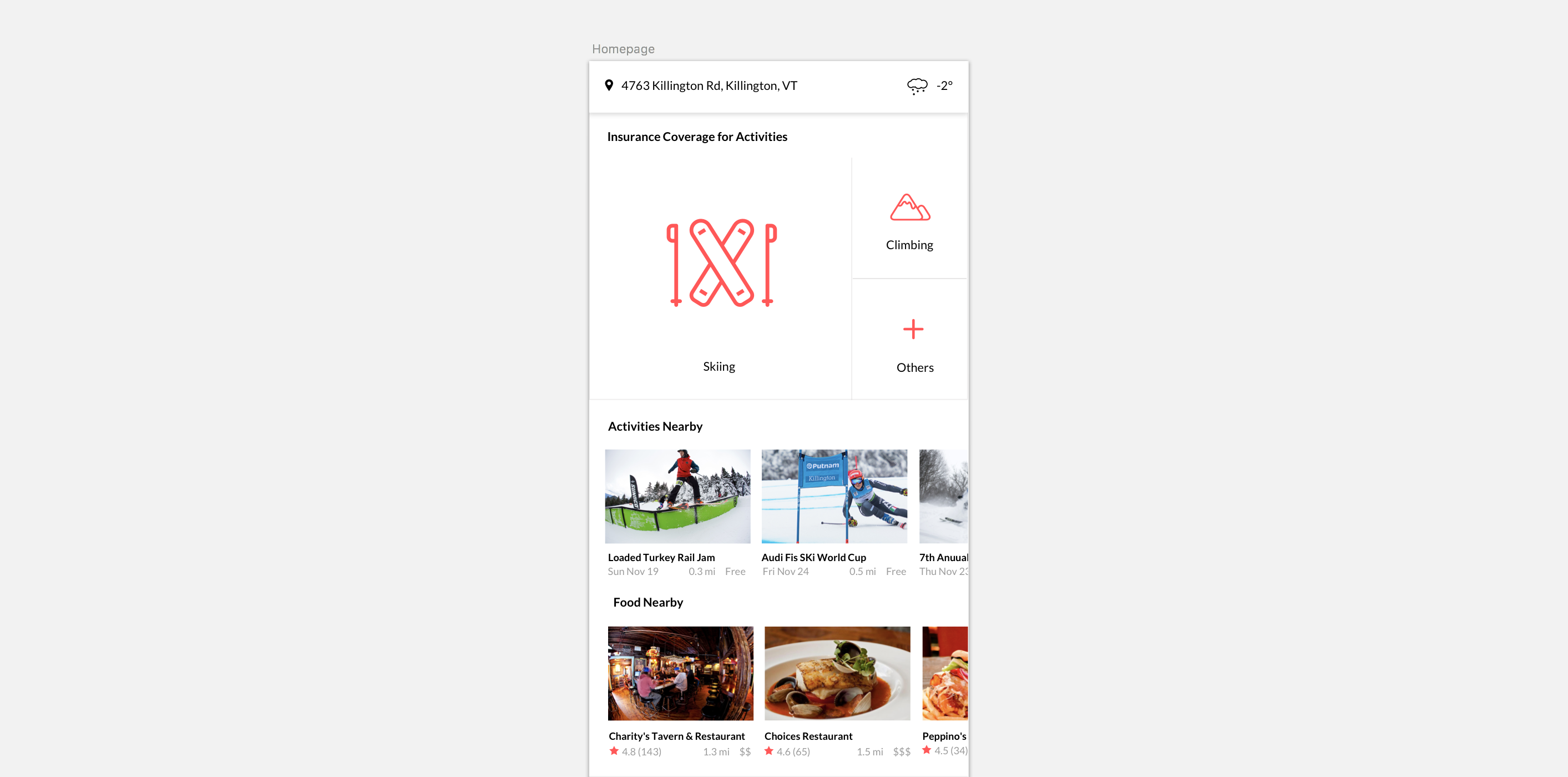
After
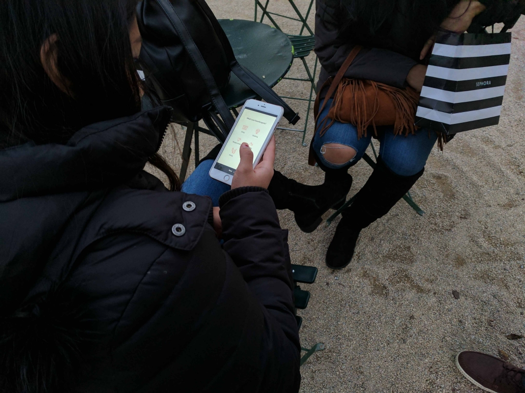
During a later stage of user testing, some users loved the design, while others raised questions which helped us identify two potential issues:
3 out of 9 users clicked or tried to click the activities and food right after they saw the homepage, because the images are more colorful and eye-catching.
Some users asked whether skiing and climbing are the only sport options, which means it is not prominent enough that there are other options.
Solving these two issues will be the focus in a future design iteration.
The insurance features should not be overshadowed by local information, although the latter "make the insurance not so boring" (quote from user). It also needs to be indicated that there are multiple sport options available.
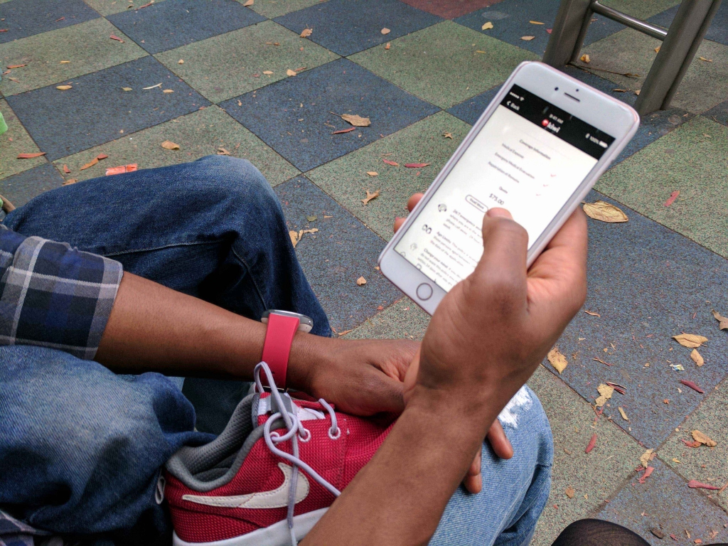
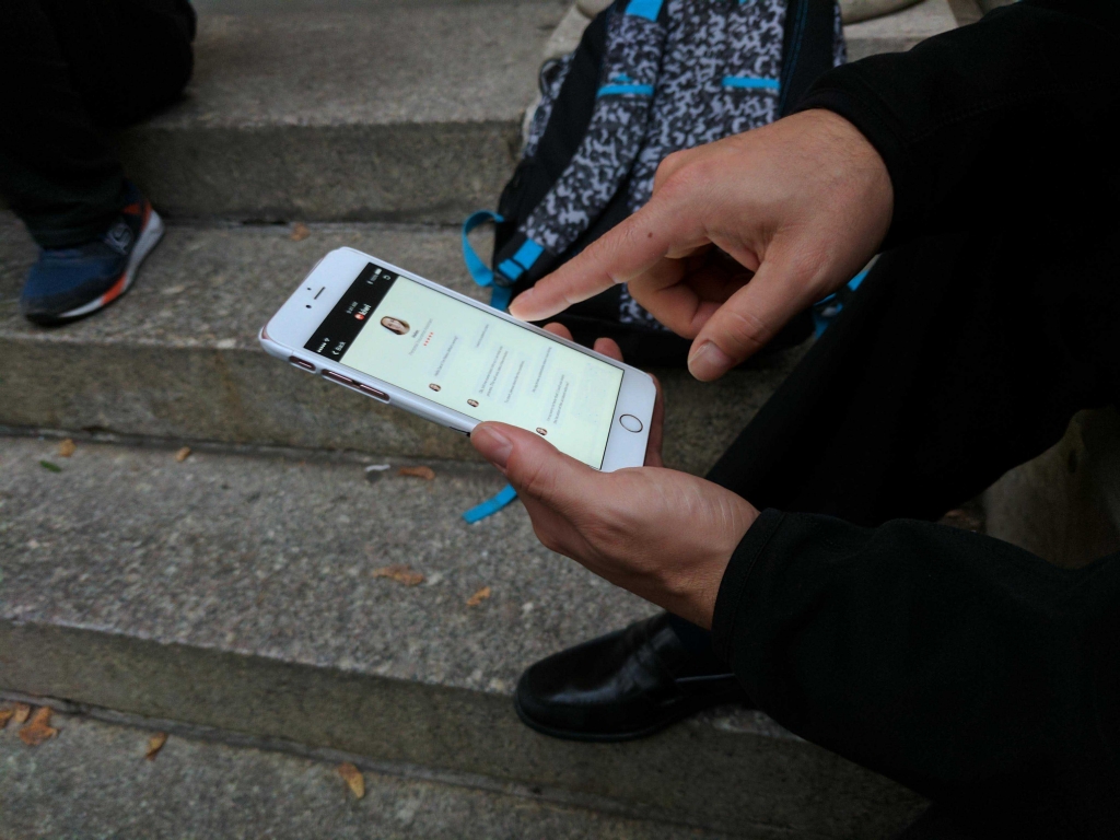
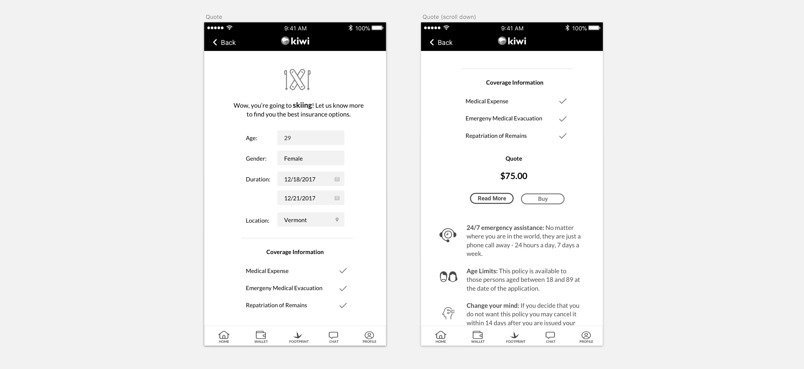
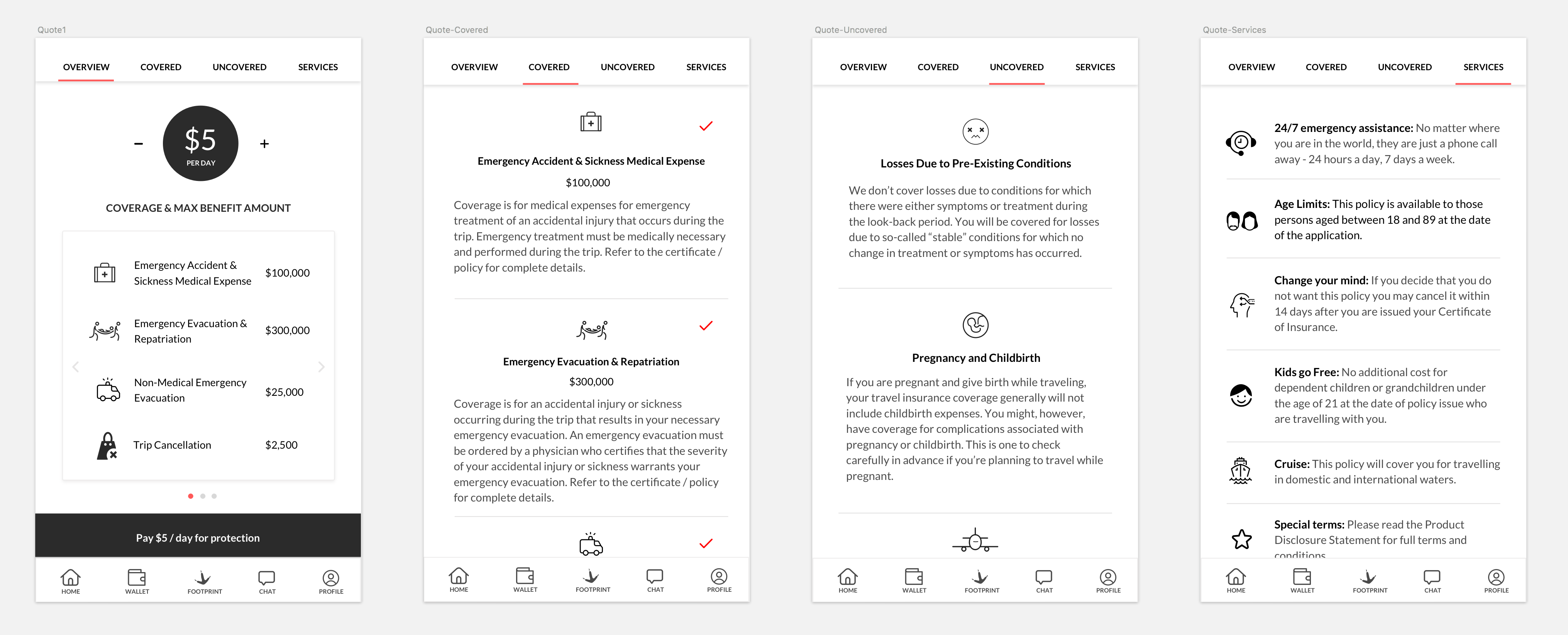
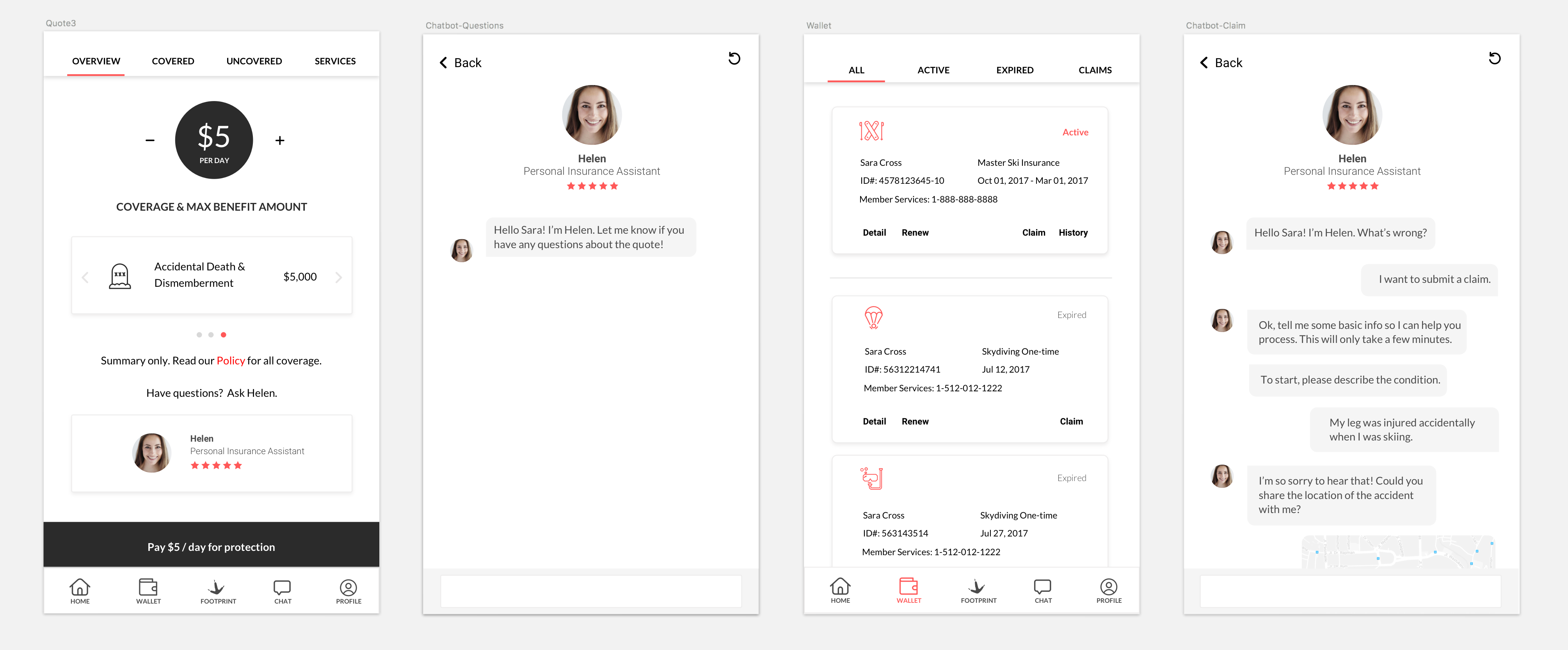
DESIGN: ITERATING ON THE INSURANCE QUOTE EXPERIENCE
In the first prototype, we placed the price, coverage and service information all on one page.
However, users found this to be too confusing. Additionally, users told us they also wanted to know what’s covered and not covered, as well as the ability to adjust price.
Before
To address those concerns, we changed the layout and some details of the “quote” screens:
Show the price per day instead of in total, and allow them to adjust the price because users are price sensitive.
Use slides to show the coverage & max benefit amount, which are what users care the most when purchasing insurance. The benefit of using slide is users stay at the same place but still getting more information needed.
The “pay button” is placed and sticked to the bottom tab bar, which is more noticeable and easy-to-use.
Use tab to separate and show what are covered, uncovered, and services users are receiving.
After
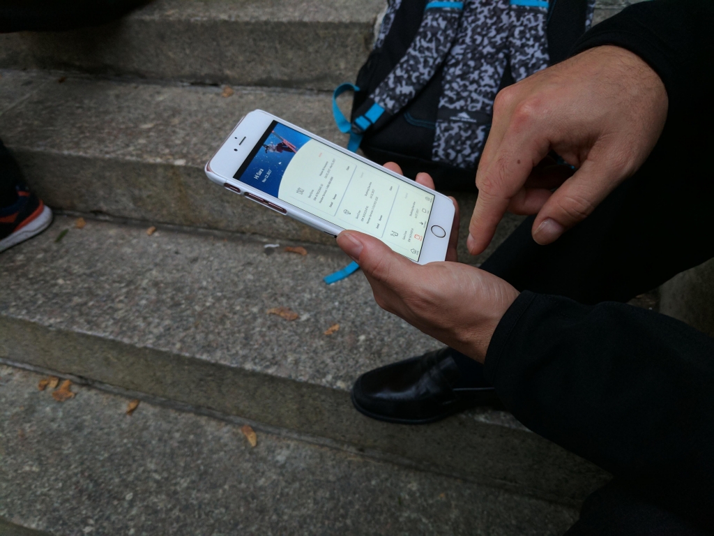
DESIGN: “FOOTPRINT” FEATURE ITERATIONS
We’re iterating on a feature called “Footprints” which automatically shows how users travel from place to place. This enables users to export a map of their personalized travels (or “footprints”).
Before
After
During a later stage of user testing, we found users loved the footprints feature. Some younger users mentioned that they also want to the app to record more information like distance, speed and elevation. We will further evaluate what to add and iterate on the design.
Design: Chatbot for customer service
Currently, we are considering two features for the AI chatbot:
Answer questions before or during purchase process
Process claims
We haven’t gone deep so far to build the entire framework of the chatbot since we want to test the idea first and see how users respond.
According to a later stage of user testing, users were open to the idea of using a chatbot for customer service, but others still preferred to call the insurance company to submit claims. Figuring out how to streamline both options would be a challenge.
There was another frequent user concern: “I already have health insurance, do I still need this?” Users felt they actually don’t know how they’re covered by the insurances they own and expect to have a tool that can help them determine their needed coverage, and also provide recommendations accordingly.
We plan to incorporate this feedback in a future chatbot design so that users can easily check their own level of coverage through a natural chat interface.
(Second round of user testing)
(Current user flow)
Next Steps
Next steps involve more design iterations to solve the issues discovered during user testing. We also plan to conduct A/B testing for certain screens, such as the homepage and footprint feature.
The state of interaction design in the insurance industry is improving, but still has a lot of room for improvement. It’s exciting to help design options that engage and educate users, ultimately helping them gain peace of mind while partaking in risky sports.