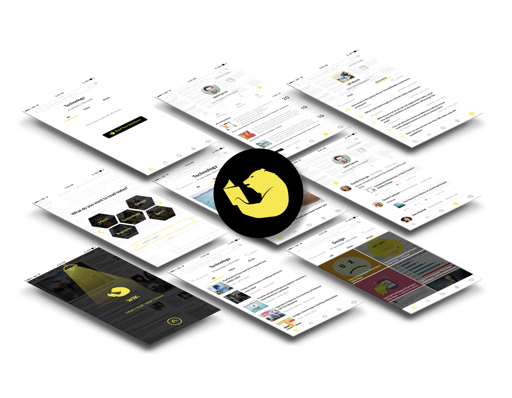
Design the news app that brings relevant news to user
My Role:
Product Designer
Duration:
One Month
News consumers are overwhelmed with information, there are many distractions and they lack focus. I designed WIK (= What I Know) to be a personalized, curated reading experience that brings relevant news to users and help them manage information.
Problem: news consumers are overwhelmed with information, there are many distractions and they lack focus.
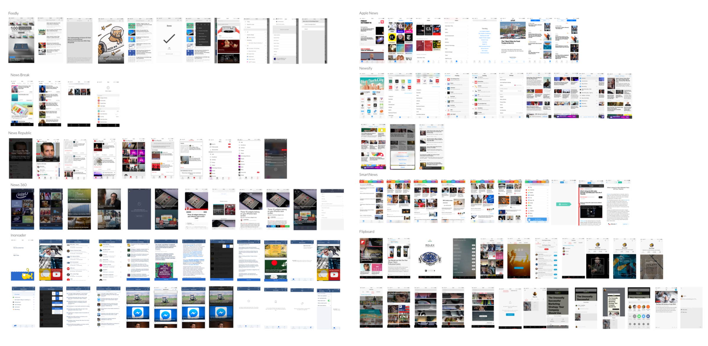
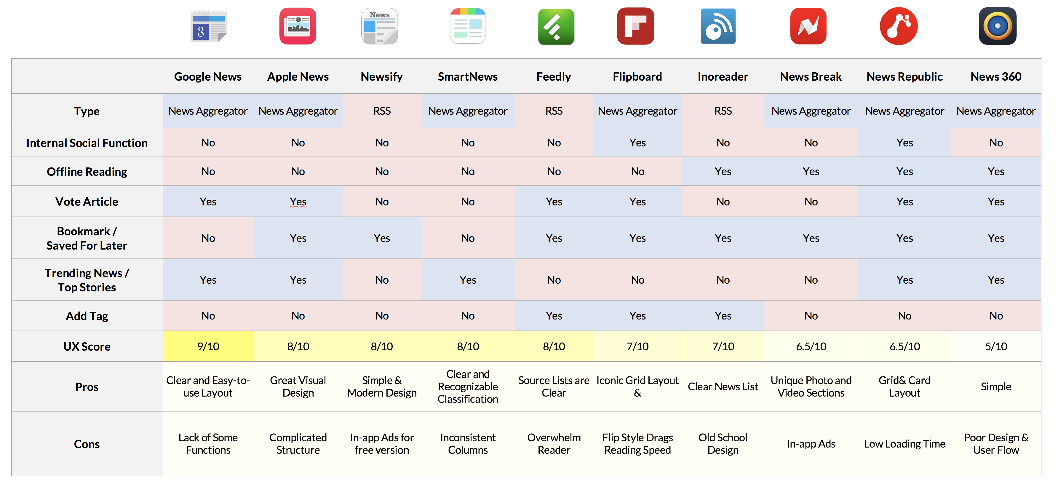
COMPETITIVE ANALYSIS
I analyzed the most popular RSS app or News Aggregator app, and compared their features and interface and interaction design.
Problems being solved: These apps help users collect news/articles users may want to read in a single place.
Problems being ignored: News source is not the only reason why people don’t read regularly – fragmented time issues and motivations also matter.
The rise of new problems: Overwhelming information is counterproductive for users to keep reading.
Existing Problems
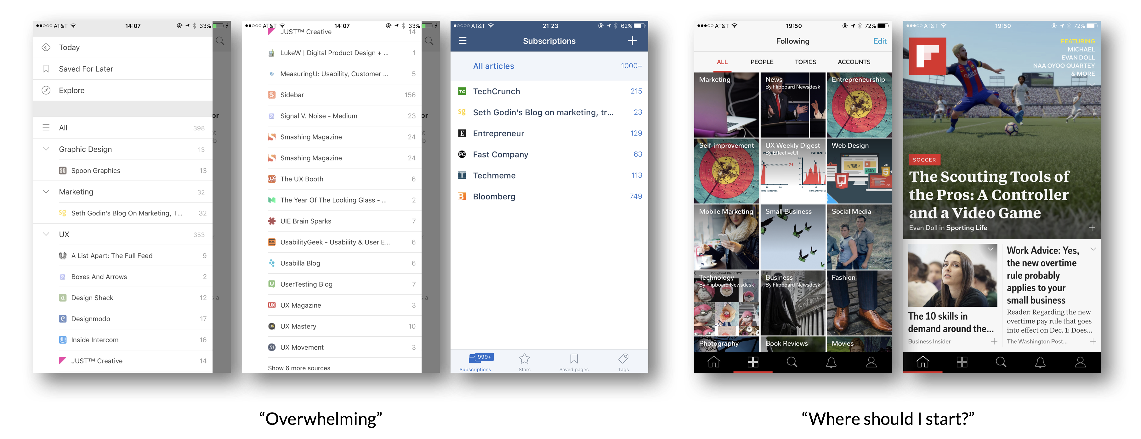
News apps overwhelm users with either too many options or doesn’t guide users through the experience.
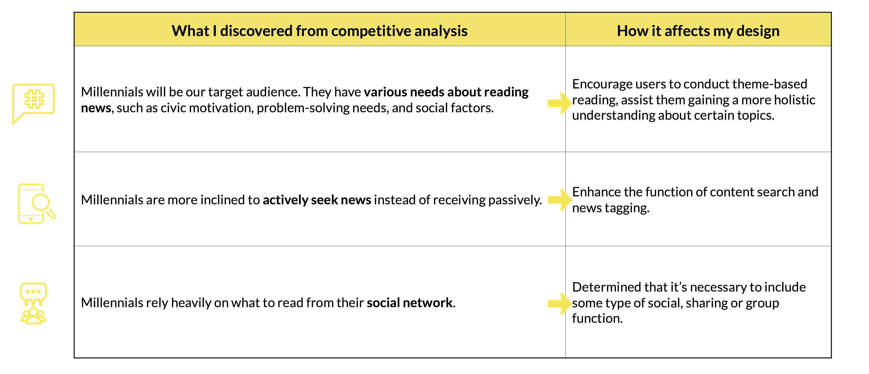
INSIGHTS FROM COMPETITIVE ANALYSIS
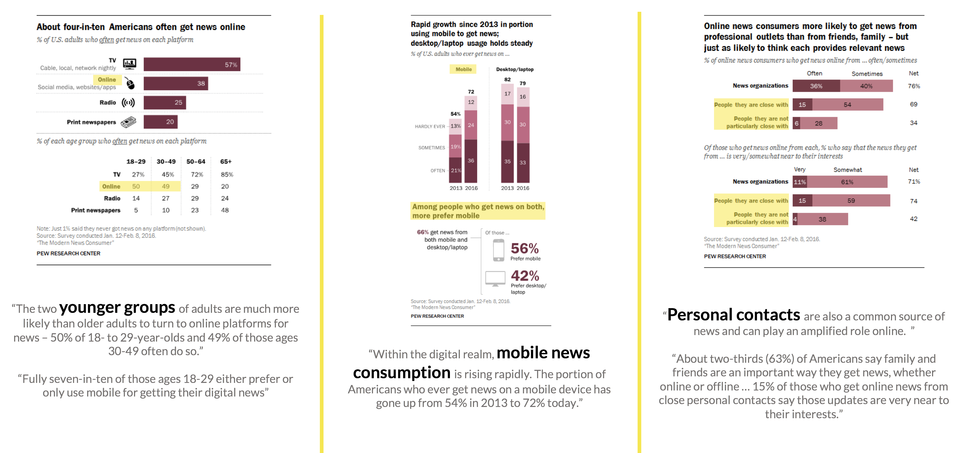
User Research - “HOW AMERICANS GET THEIR NEWS”
Source: Pew Research Center (2016)
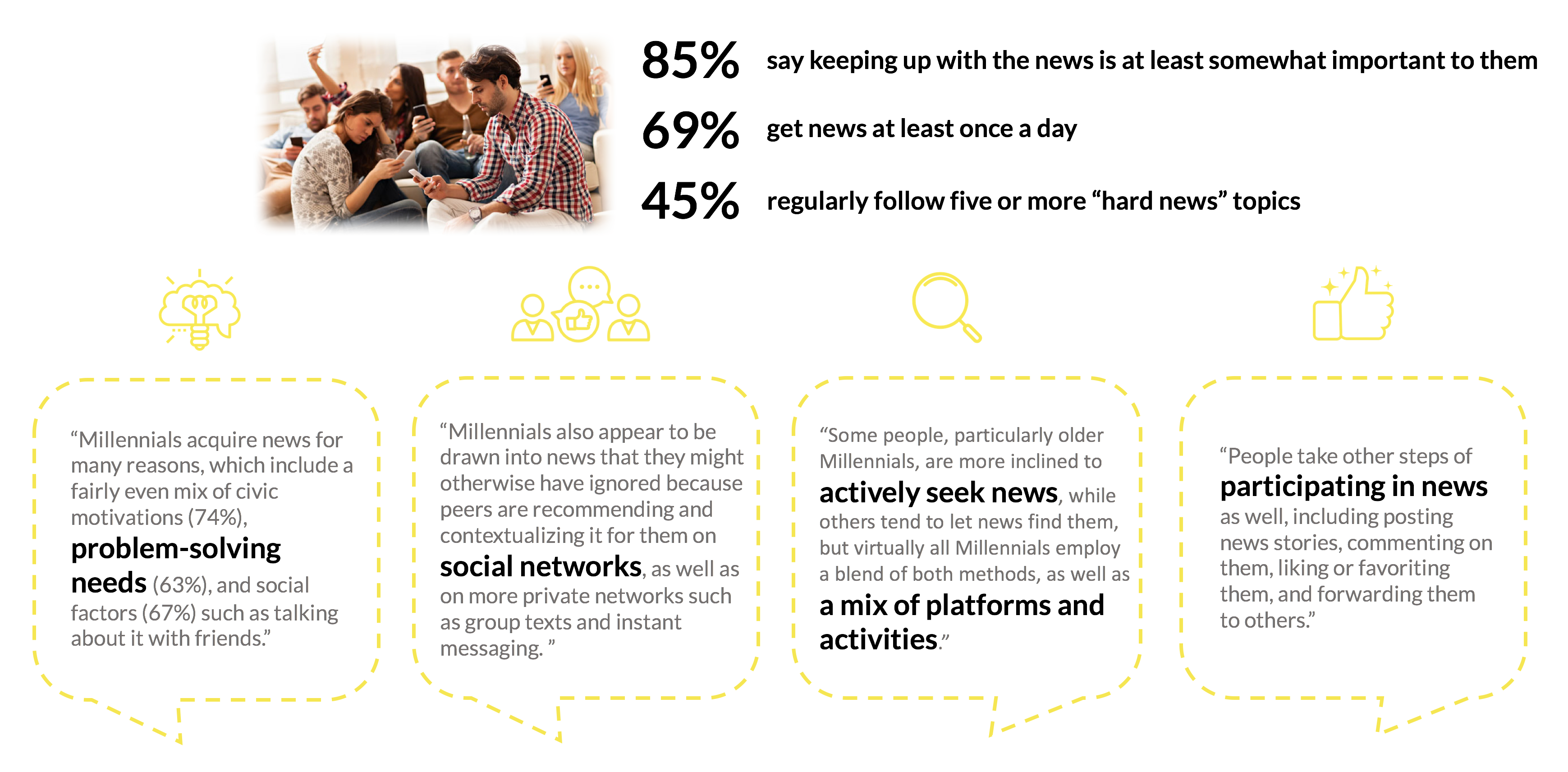
User Research - “HOW MILLENNIALS GET NEWS”
Source: American Press Institute(2015)
INSIGHTS FROM USER RESEARCH
Source: American Press Institute(2015)
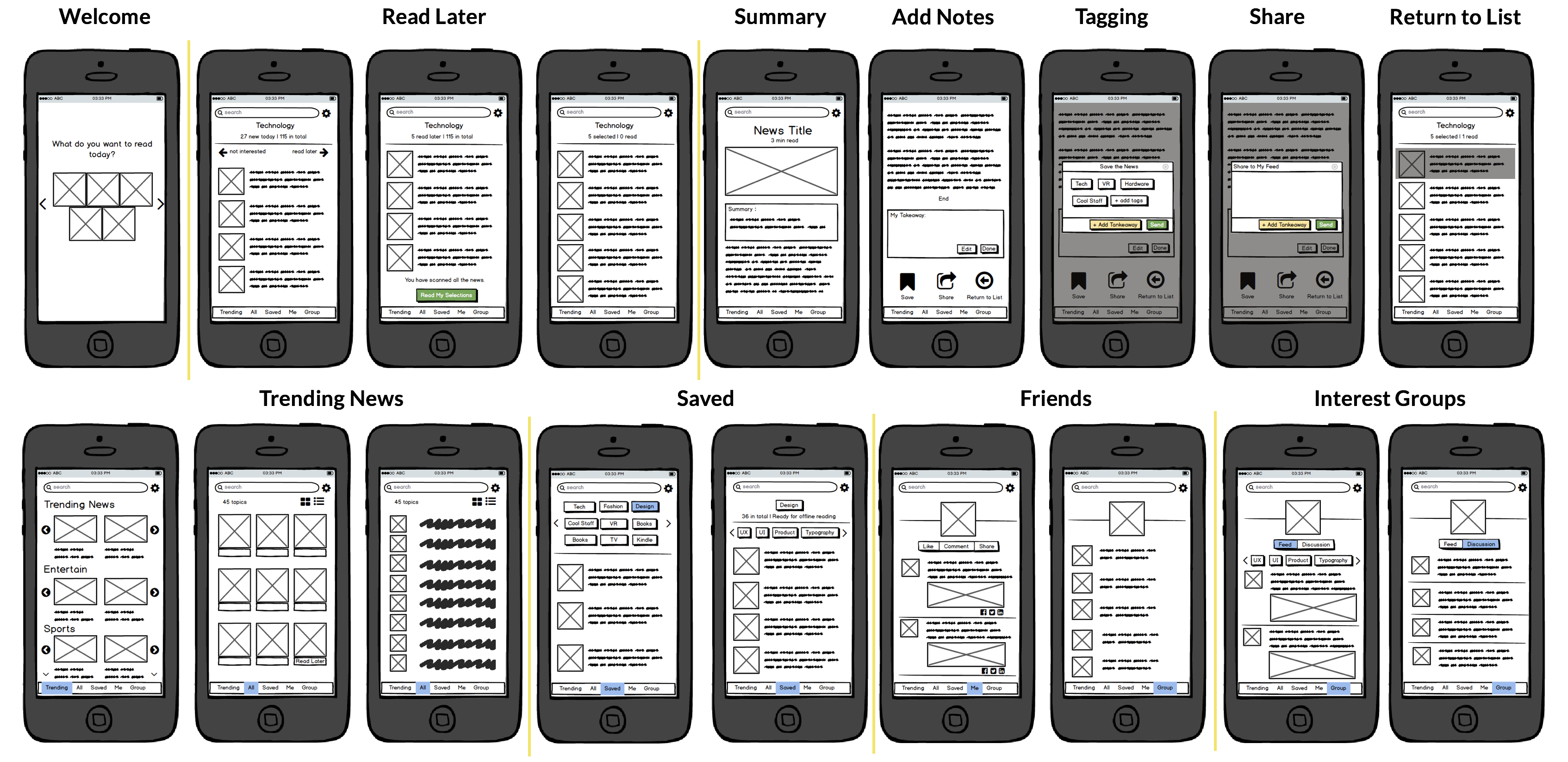
Wireframe
As part of my ideation process, I identified the most important user flows, then created low-fidelity wireframes to generate design ideas quickly.
Source: American Press Institute(2015)
Design
Conclusion & Learning
The research for WIK confirmed the growing mobile reading trend. Millennials used to read in screen and they have many personal expectations and social needs for reading news. For them, the news app should act more like a tool than an information source.
I learned from competitive analysis that most news aggregator has predefined categories and system design, versus RSS has more customization but less control over content and design. How to combine their advantages is a good start for next generation news app.
Screen size, environment limitations and user scenario matter a lot to mobile UX & UI project. Think questions like “what if people use the app on public transit (without internet connection)?”, “what will happen if they use it when waiting for a coffee?” is very helpful to create thoughtful mobile design.