Design a brand new companion app for library users
My Role:
UX Designer
Teammate:
UX Designers, Researchers, Content Strategist
Duration:
Three Months
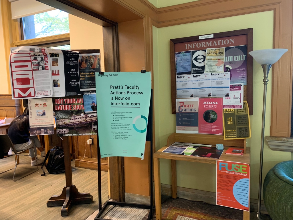
Pratt Institute, one of the top colleges for art and design, has two libraries in both its Brooklyn and Manhattan campus. As the “first free public library in Brooklyn”, it’s actually a landmark designation for the building in Brooklyn. The librarian team was looking for conducting a redesign of its website and improving the overall user experience for library users. A team of 16 researchers and designers were assigned the task to propose a new proposal for improving both its online and offline experience. My team focused on part of the initial researches and the design of a companion app for library users.
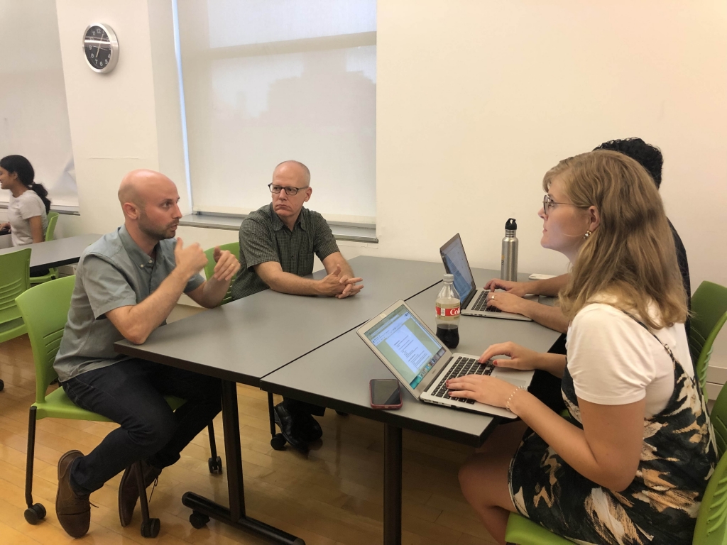
Stakeholder Workshop
To better understand the need and current state of Pratt Library, we hosted a stakeholder workshop to interview five library staff, including the Director of Library and Digital Learning Librarian, Library Teaching & Learning Librarian, Electronic Resources andSystems Admin.
At first, we separated into five groups to have interviews with each staff at the same time, sharing a same interview protocol, which helps us understand how they manage the library website and digital resources, who are the users and competitors/peers (from their perspective), what are the goals and metrics they have. I, partnered with three other teammates interviewed the Library Teaching & Learning Librarian.
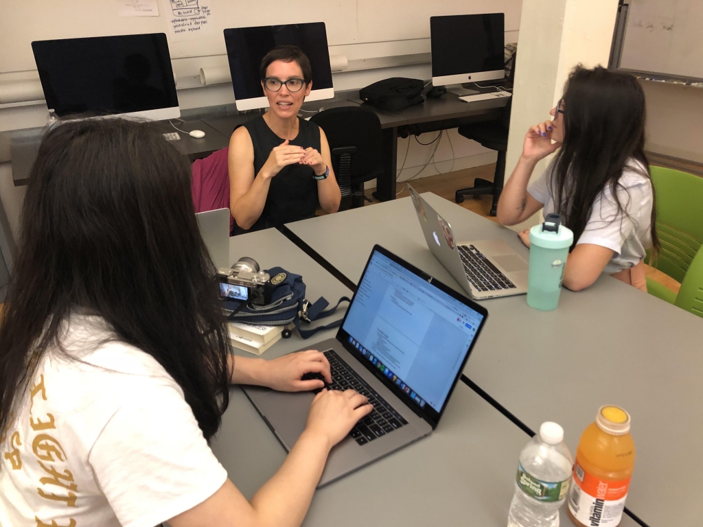
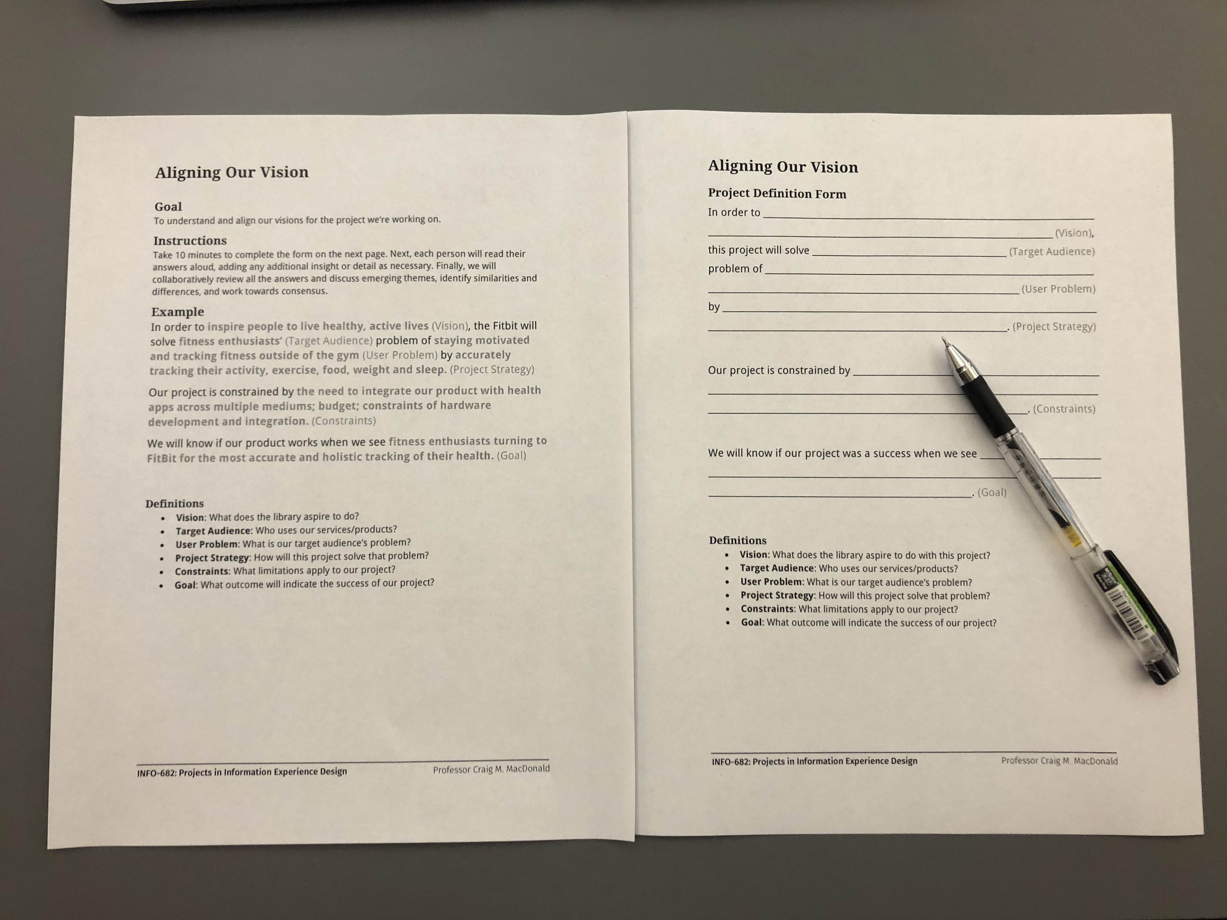
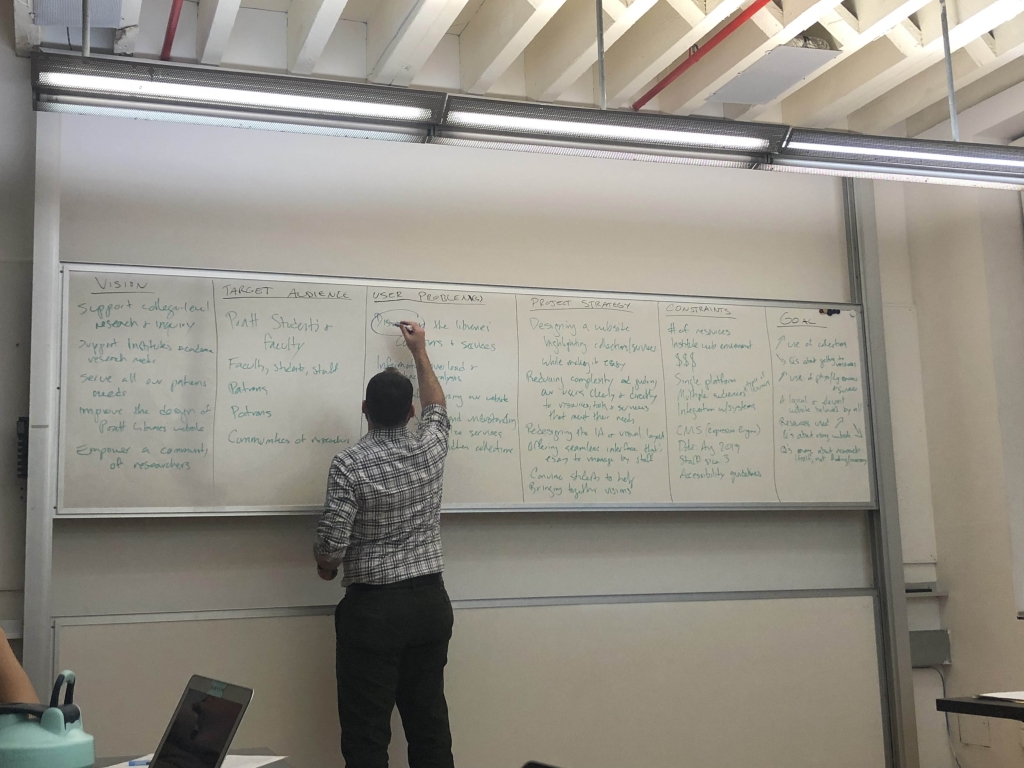
Project Definition Form
Then we invited them to fill out a “Project Definition Form”, read their answers aloud and add the necessary context and other details. It’s a very effective way to understand and align our vision for the project we’re working on. After collecting all the answers, our team had a debrief session to identify similarities and differences, and then condense a mission statement for this project.
The mission of the Pratt Institute Libraries is to provide outstanding service and access to a resource-rich environment that facilitates critical thinking and creative teaching and learning in the Pratt community.
Initial Brainstorming
After understanding the goals of stakeholders, our team started brainstorming about next steps. We decided to start with conducting user researches to understand what users think and expect. Depending on the time and resources we have, we decided to break into different teams to conduct: user survey, user interview, observation, content strategy, literature review and peer analysis.
The researches will focus on:
Users’ expectations, perceptions, likes/dislikes, and level of awareness of the library and services
Services that are used the most and the manner in which they are used
Information architecture of website
Experience in the library space
User Research
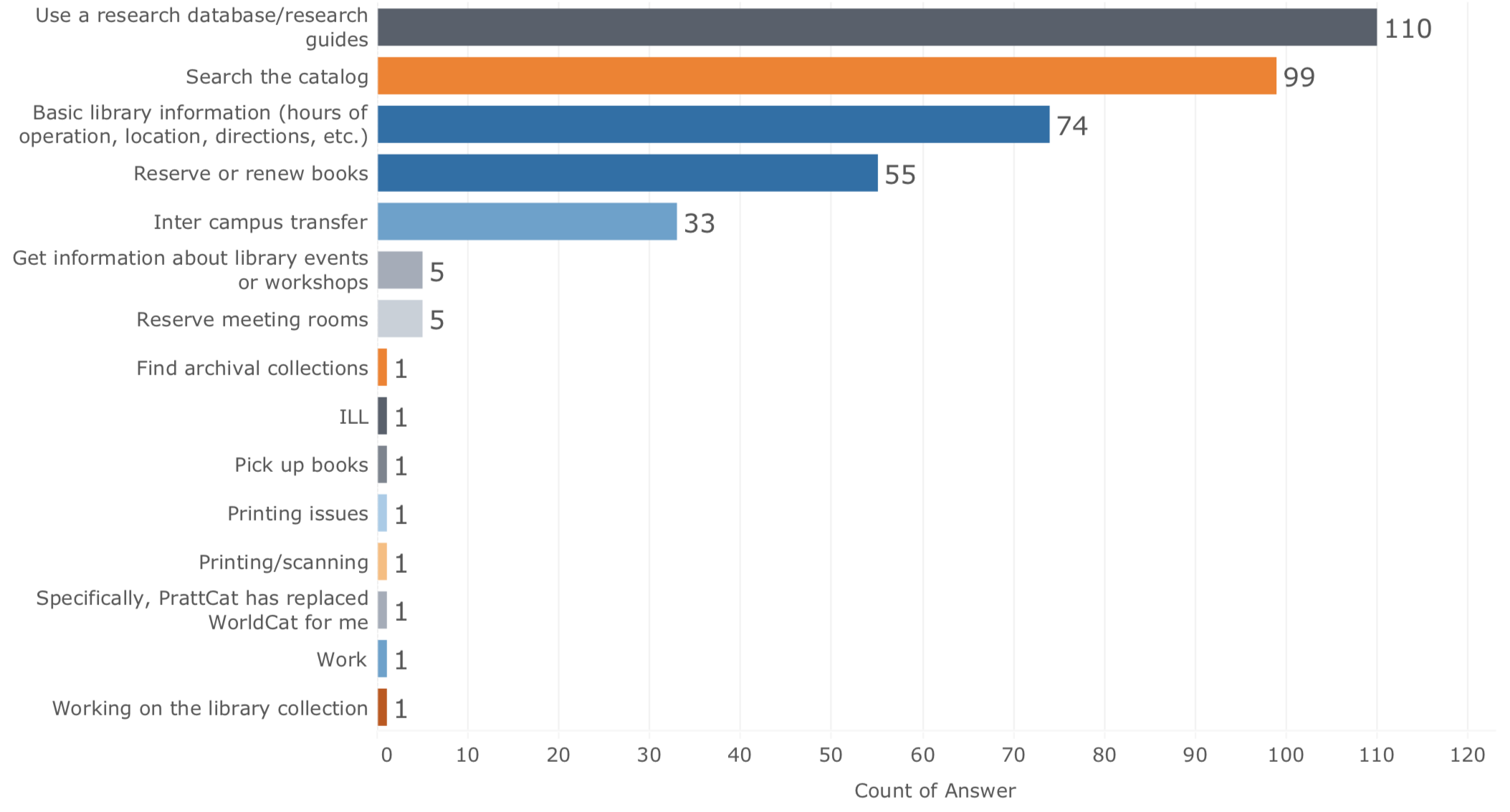
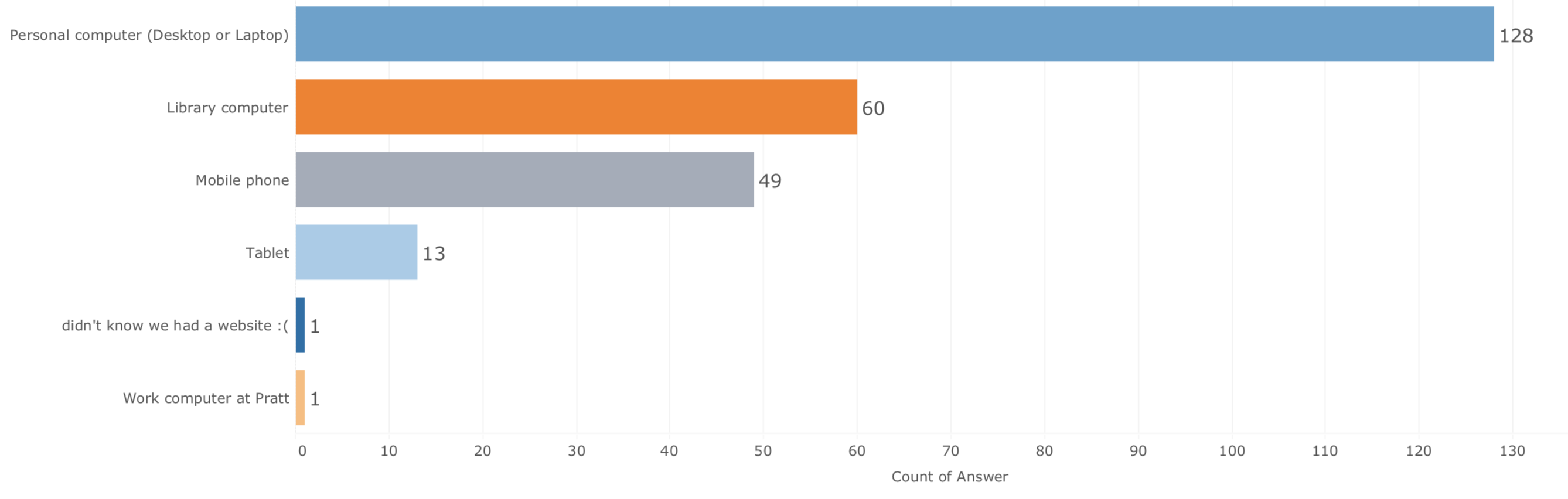
With 150 survey responses and 30 interviews, research results show that nearly 1/3 users access library via mobile phone. The primary user group responded the survey includes: Undergraduate Student (61), Graduate Student (52), Faculty (27), and Library Staff (13). The main reasons of visiting the library reviewed from the research help us decide what features to include in our companion app design:
Use a research database/research guides
Search the catalog
Basic library information (hours of operation, location, direction, etc)
Reserve or renew books
Inter campus transfer
Reasons of visiting Pratt library website
Access to library by devices
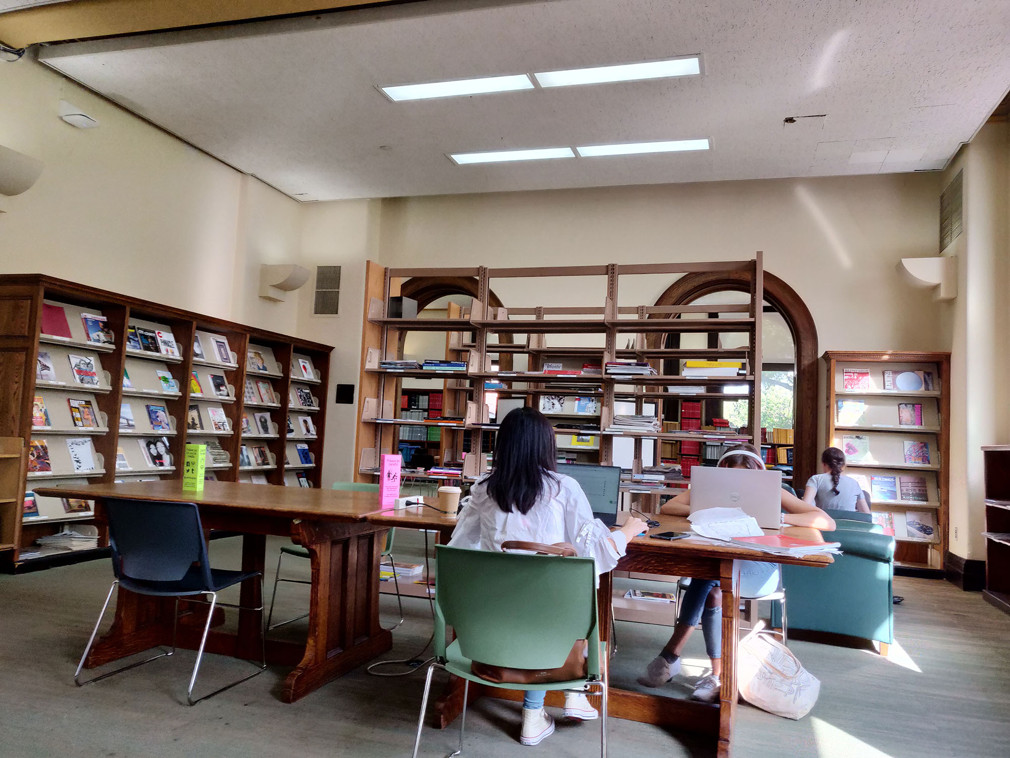
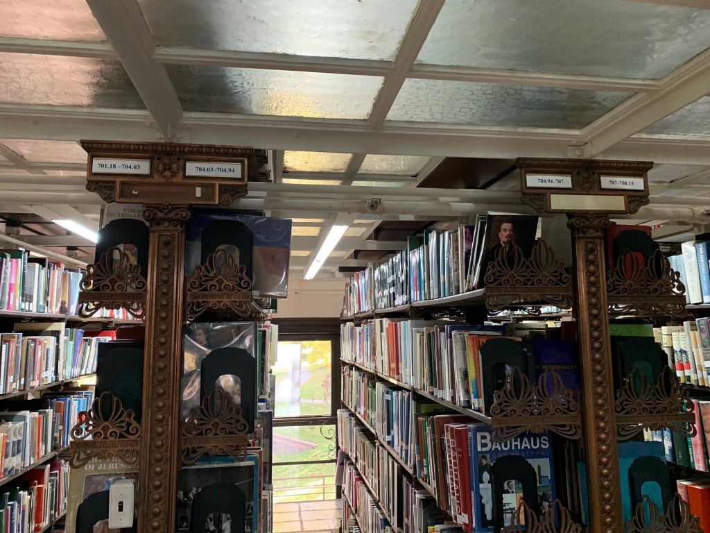
Library Observation
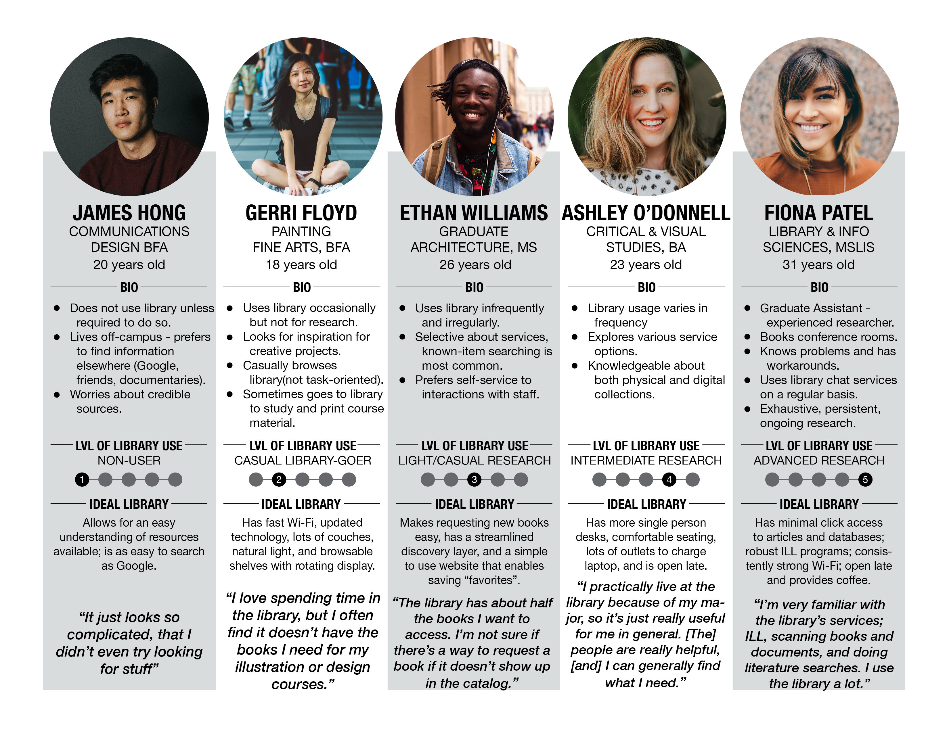
user Persona & Journey Map
We created a user persona which includes five different user types based on their research level, which can better cover the similarities and characteristics of each user types. They are not grouped by undergraduate student, graduate students or faculty any more, instead, they are grouped as:
Non-User
Casual Library-Goer
Light/Casual Researcher
Intermediate Researcher
Advanced Researcher
User Persona of Five User Types
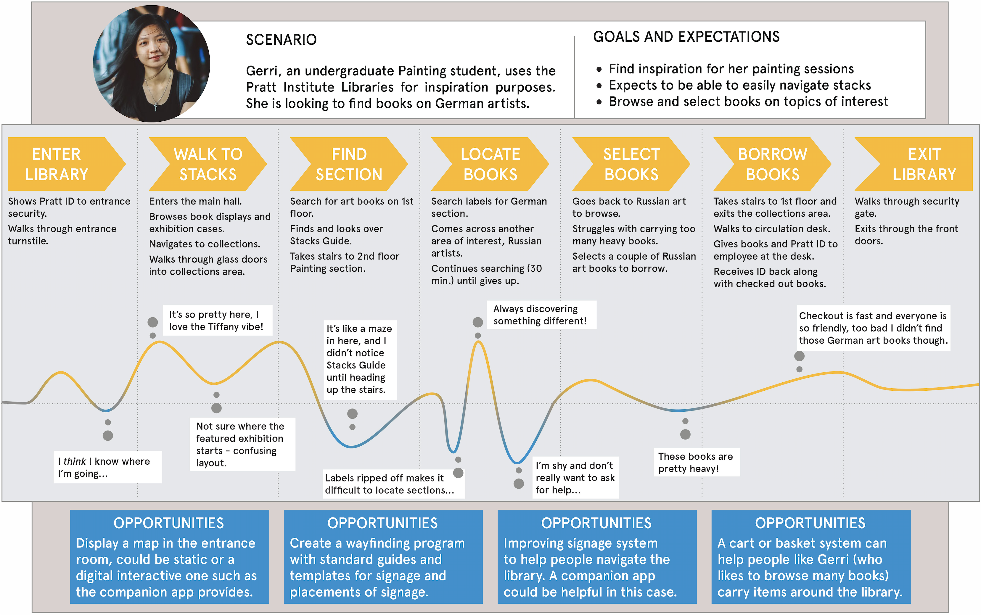
User Journey in Library
Based on the pain points and expectations users have, we further confirmed that a responsive website can’t satisfy all user needs. Users are heavily relying on mobile phone and have high expectations about the mobile user experience nowadays. So our team decided to design a companion app to assist users’ in-library experience, which won’t replace the library website while will be an easy way for users to find books and manage their reservations and borrowing dues.
Users want an easy way to locate books and resources in the library; Librarians want to better inform users about the events in the library.
Peer Analysis
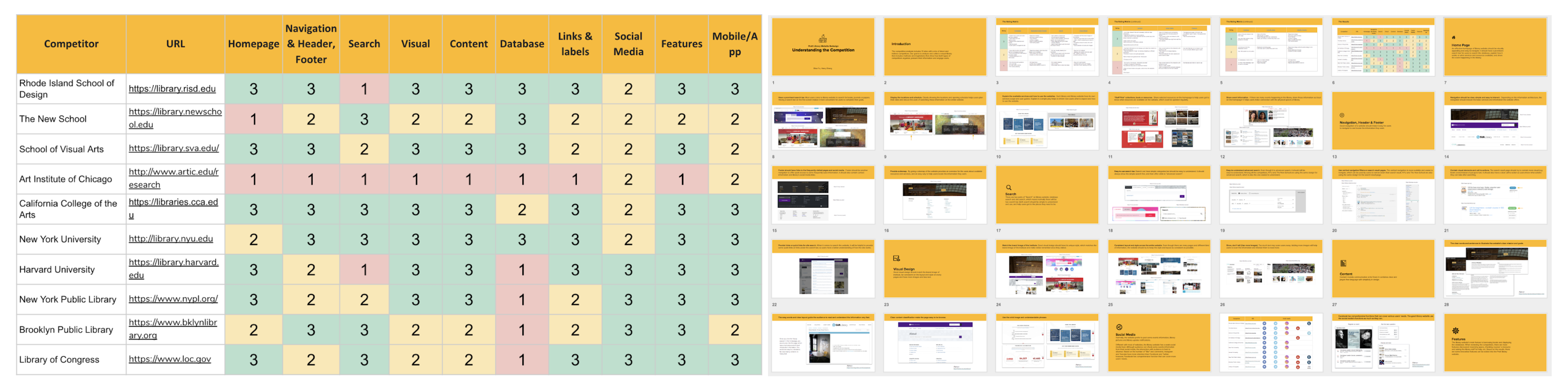
Before jumping into design, I took the lead in conducting a peer analysis of both academic and non-academic library websites, analyzing 10 websites from 10 different aspects including homepage, navigation, search, visual, etc.
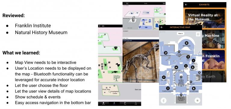
The report supported the design process of both the website and app teams. For the mobile app team, we conducted an additional analysis of two mobile app to learn from other companion apps of a library/museum, especially how the map works and primary features of the app.
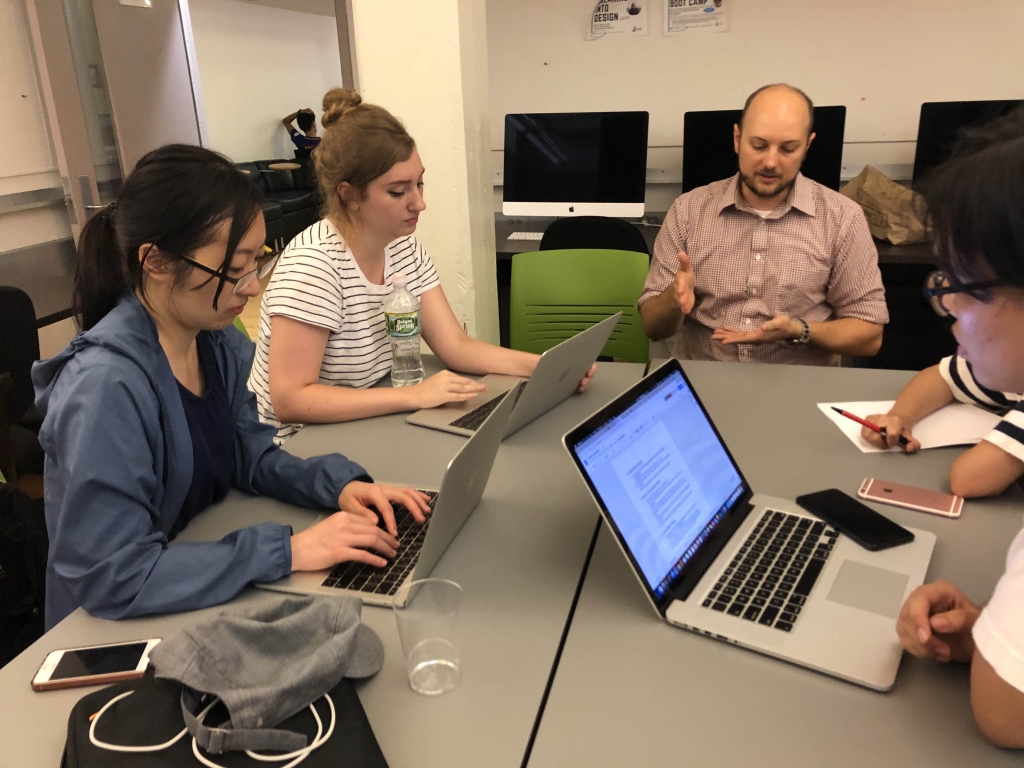
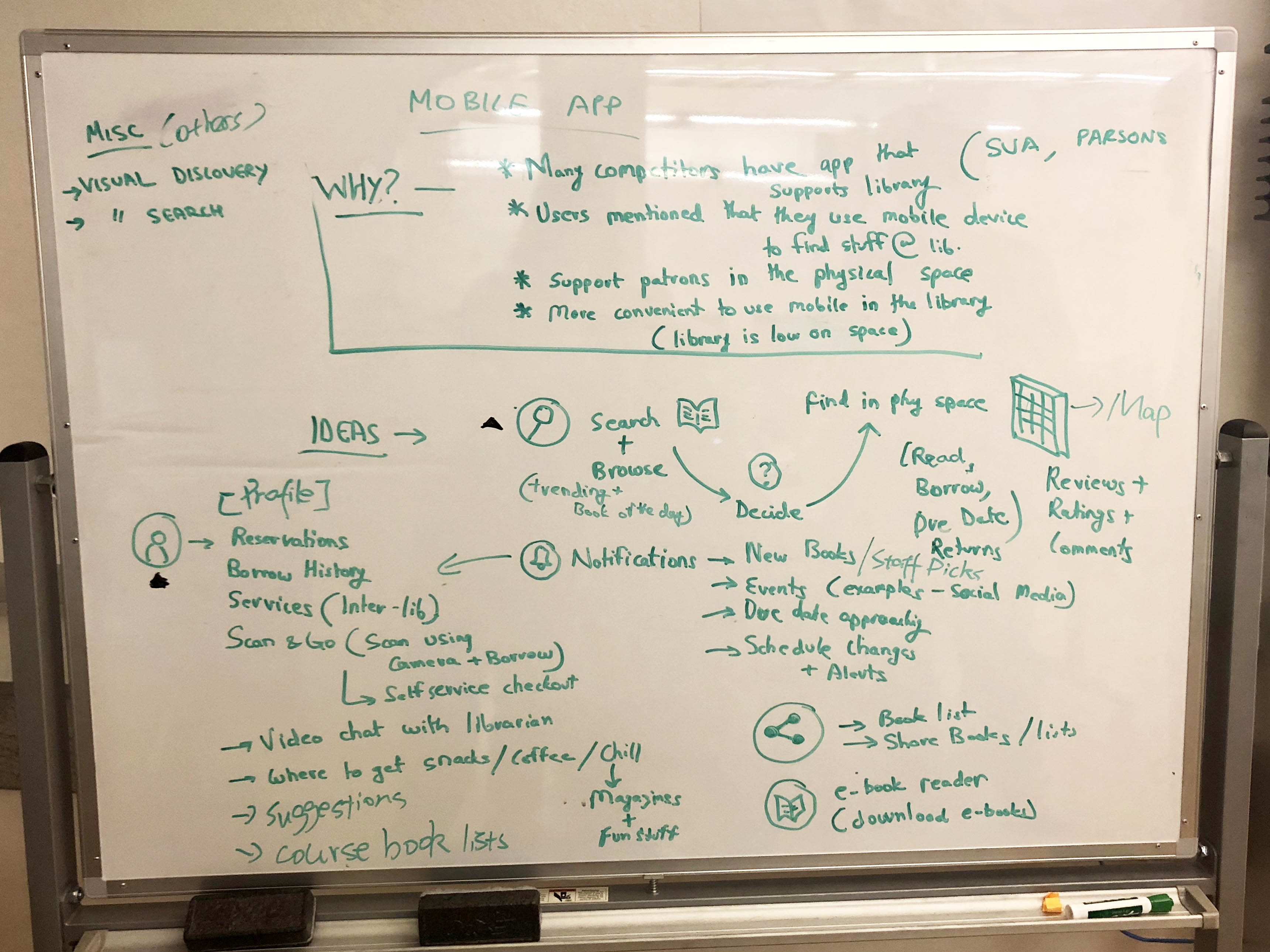
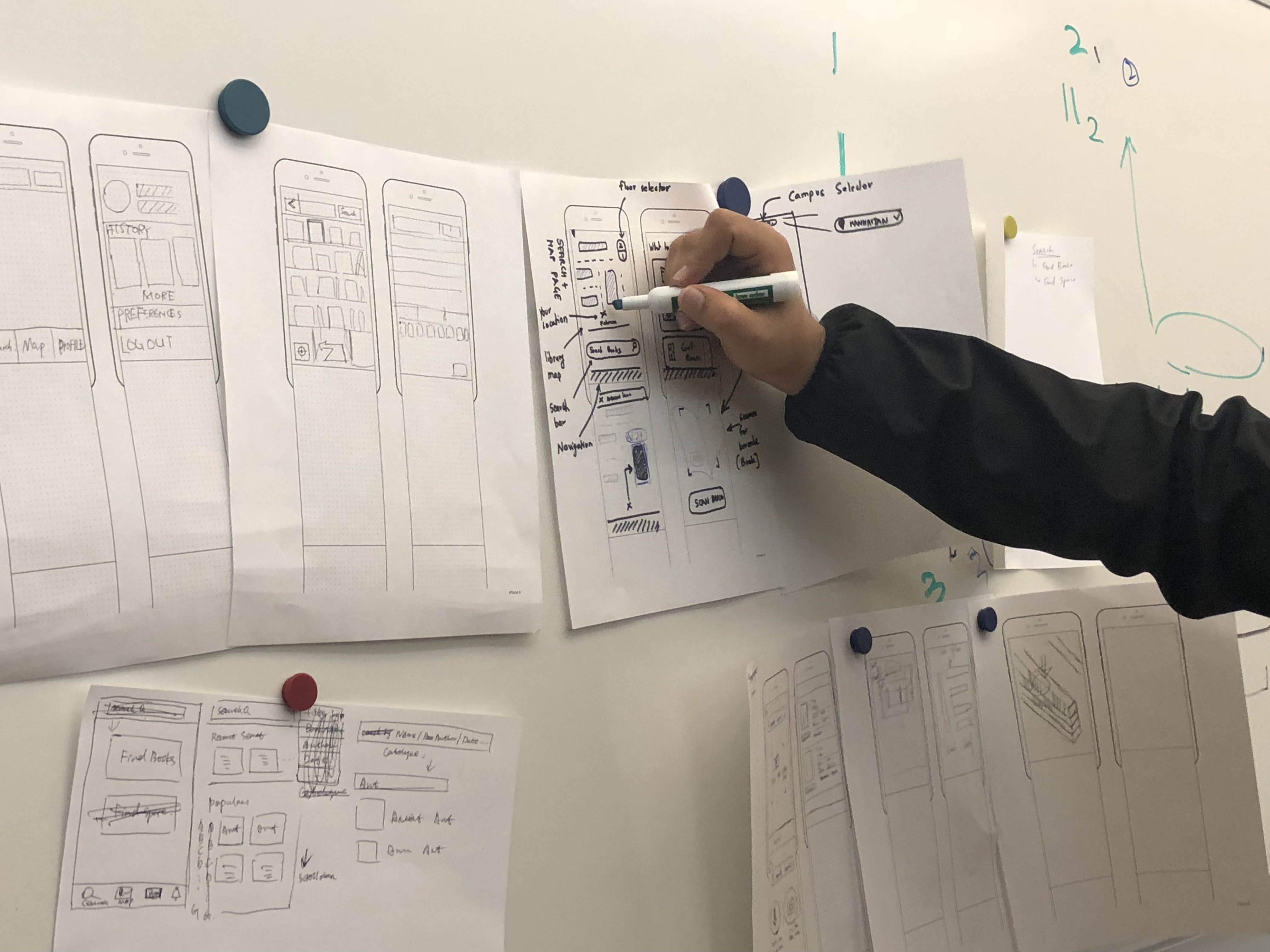
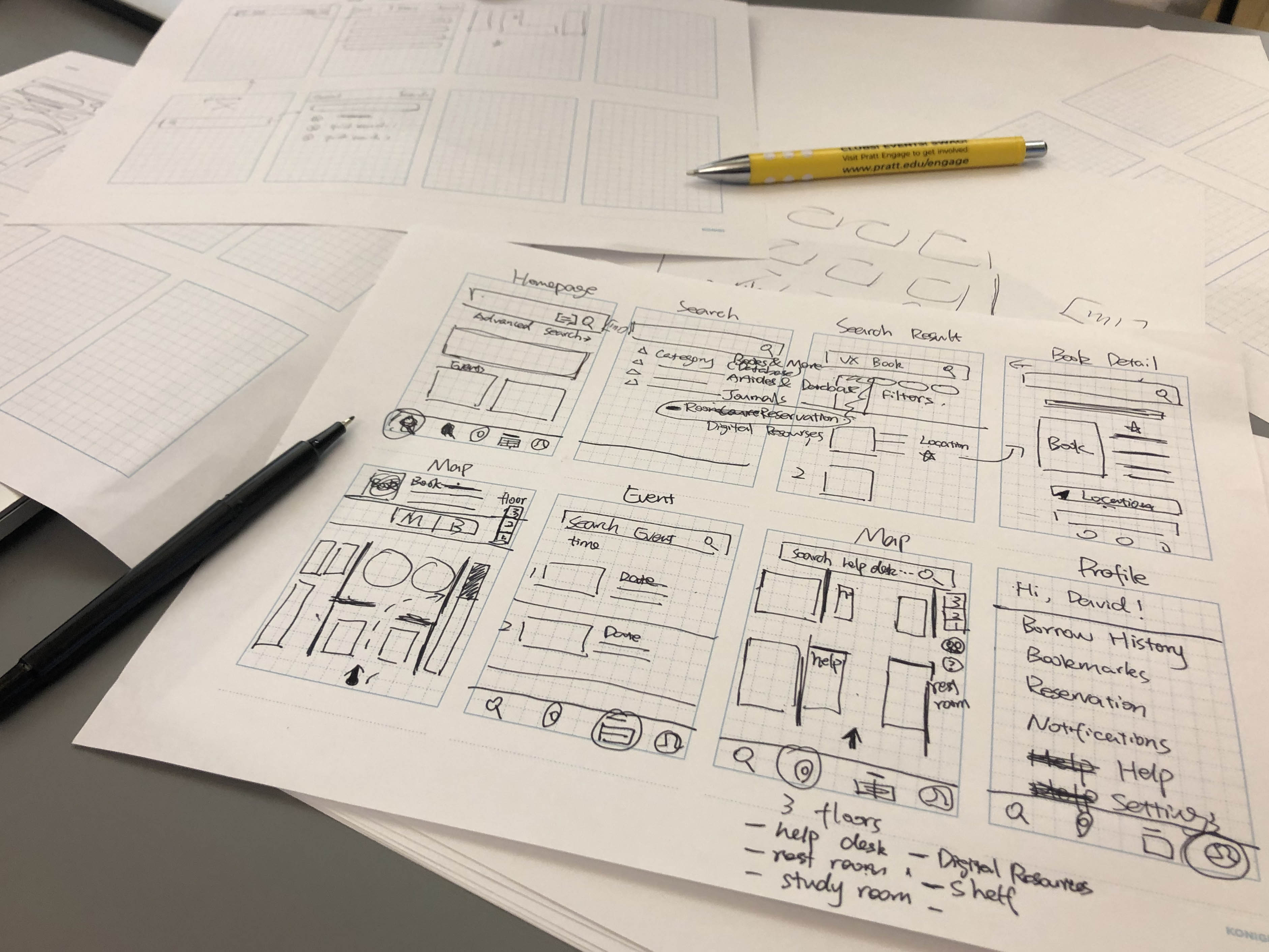
Wireframing
With all the user insights and inspirations, I brainstormed and prioritized the features with 4 other designers. Then we wireframed together and discussed the initial ideas about the structure and visual components of the app. After several round of discussions and iteration, we decided the app should include map, book search, profile, notification and help sections.
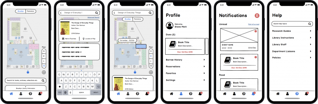
User Testing
Based on the paper wireframes, we created a digital low-fi prototypes with Balsamiq and conducted user testing with 8 users. Overall, participants have a very positive review of the prototype:
“This app covers pretty much everything”
“I would definitely download it”
“It is well structured”
Low-fi prototype
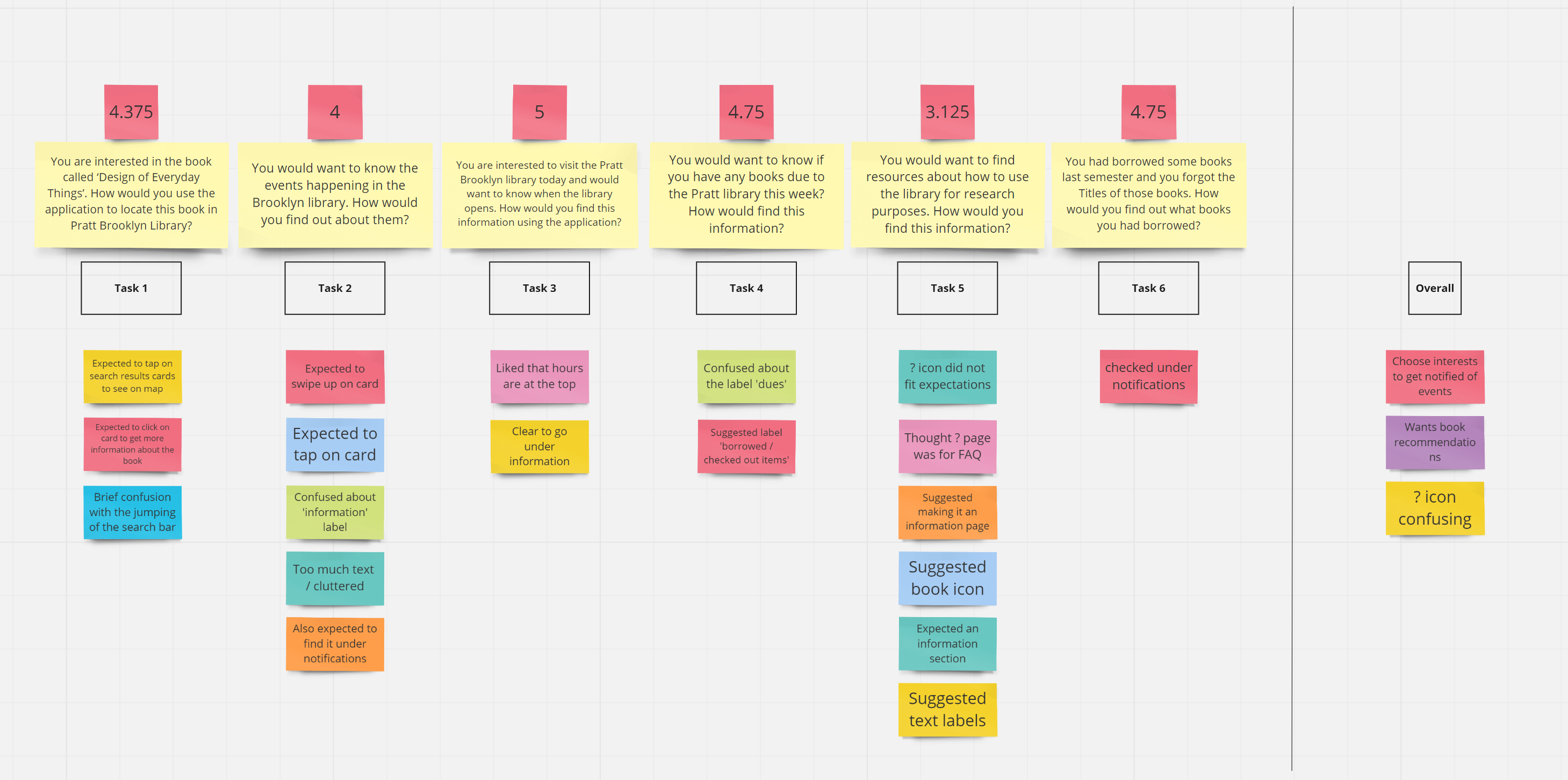
Affinity Mapping - User Testing of Low-fi Prototype
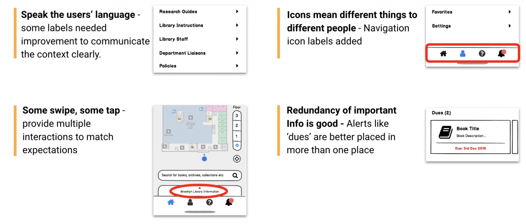
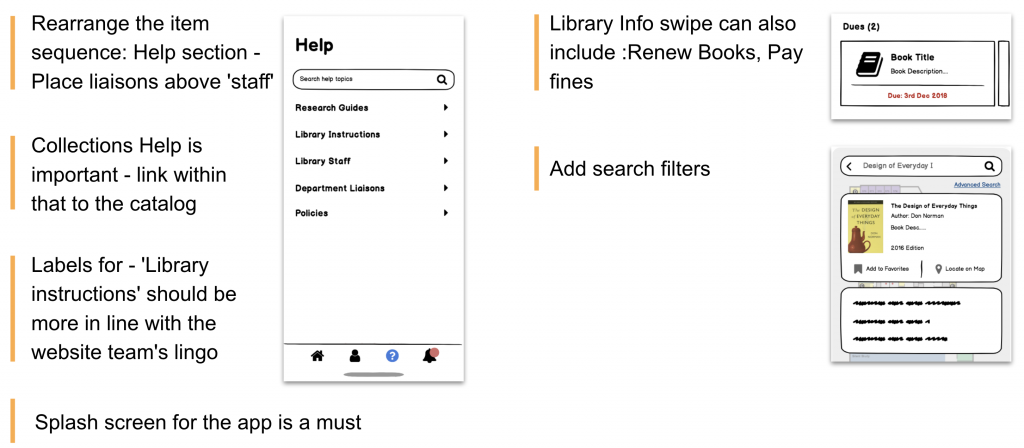
The user testing also identified some improvement areas for our final prototype:
Main Findings
Stakeholder Feedback
We also shared the low-fi prototype with our project stakeholder to obtain feedback. They also have positive feedback of the overall design, and then gave us some suggestions of perfecting the details.
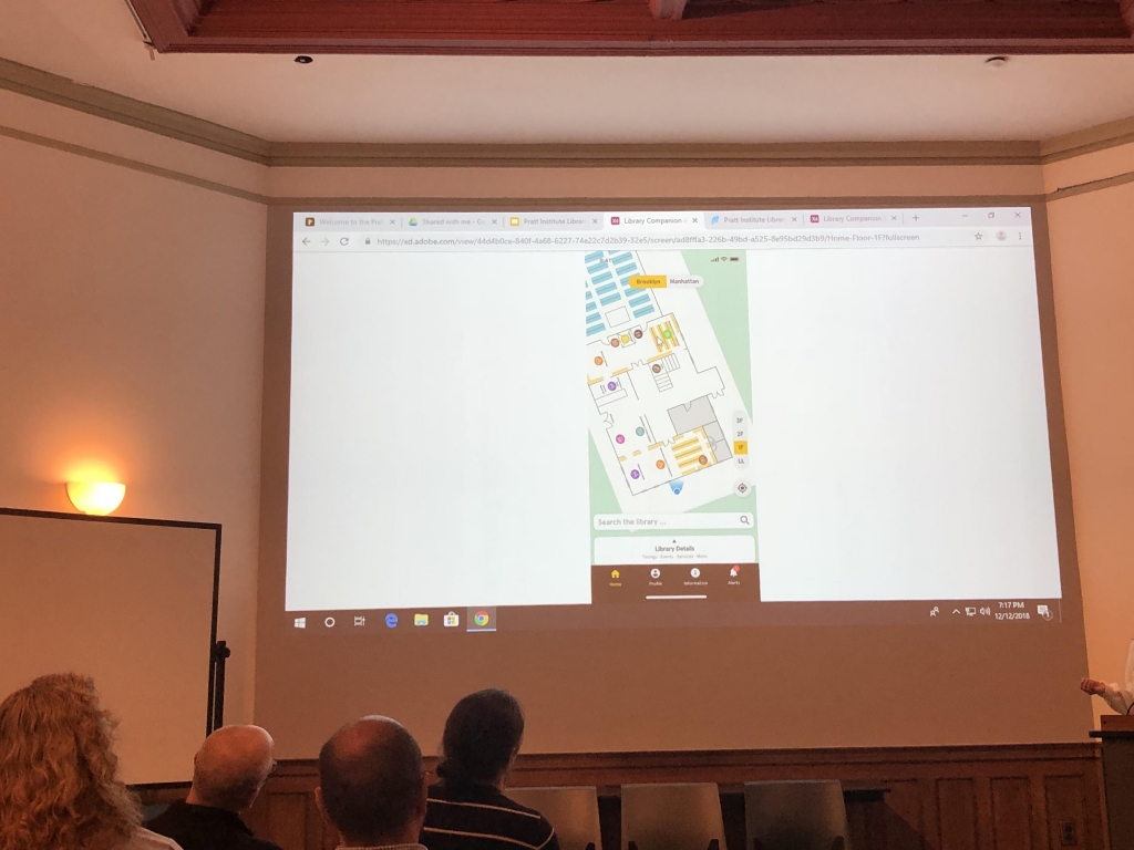
Hi-fi Prototype & Refine the map
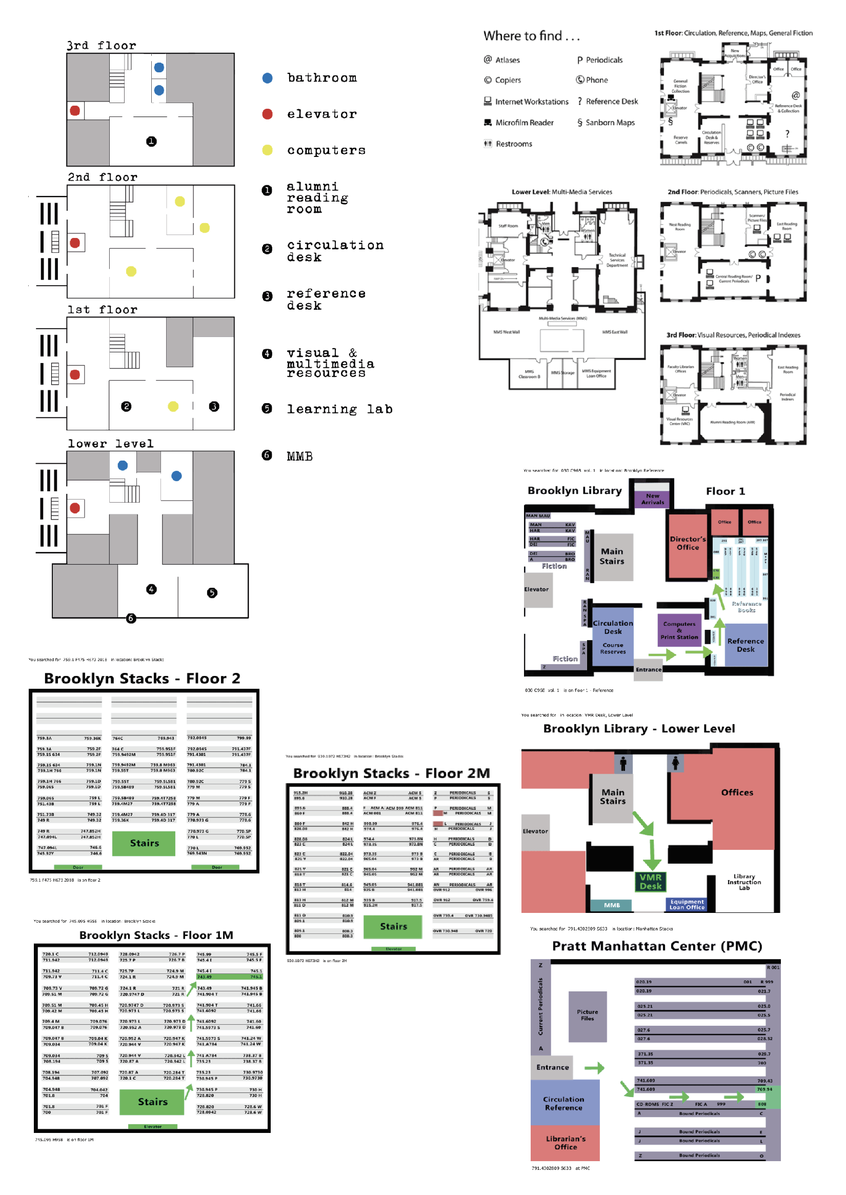
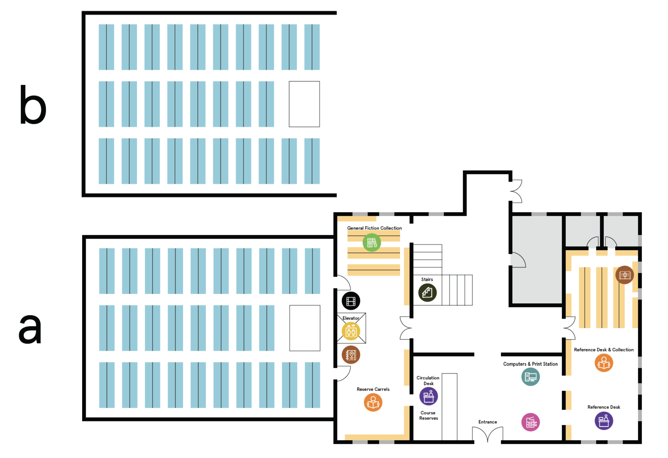
As one of the most important part of the app, the library map also needs to be revised. Previously, Pratt Library have many different version of the maps as shown below. Some of them weren’t up-to-date, and some of them didn’t include all the details. More importantly, there is no a map correctly showing the relations of the book stacks and other part of the floors in the Pratt Brooklyn Library. Therefore, I worked with another designer to combine the maps, revise the visual style, and add it to the final app prototype.
Previous versions of library map
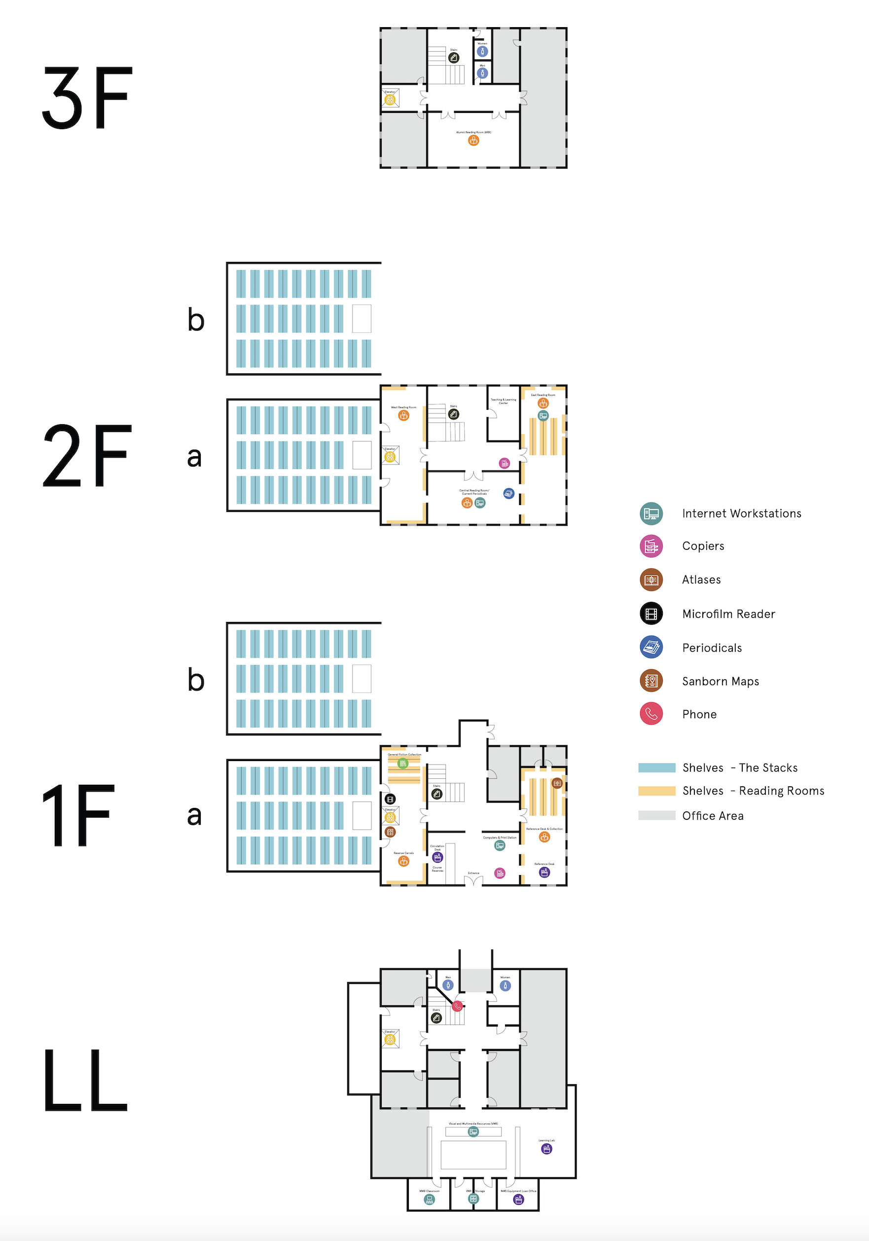
Revised map
Revised floor map example
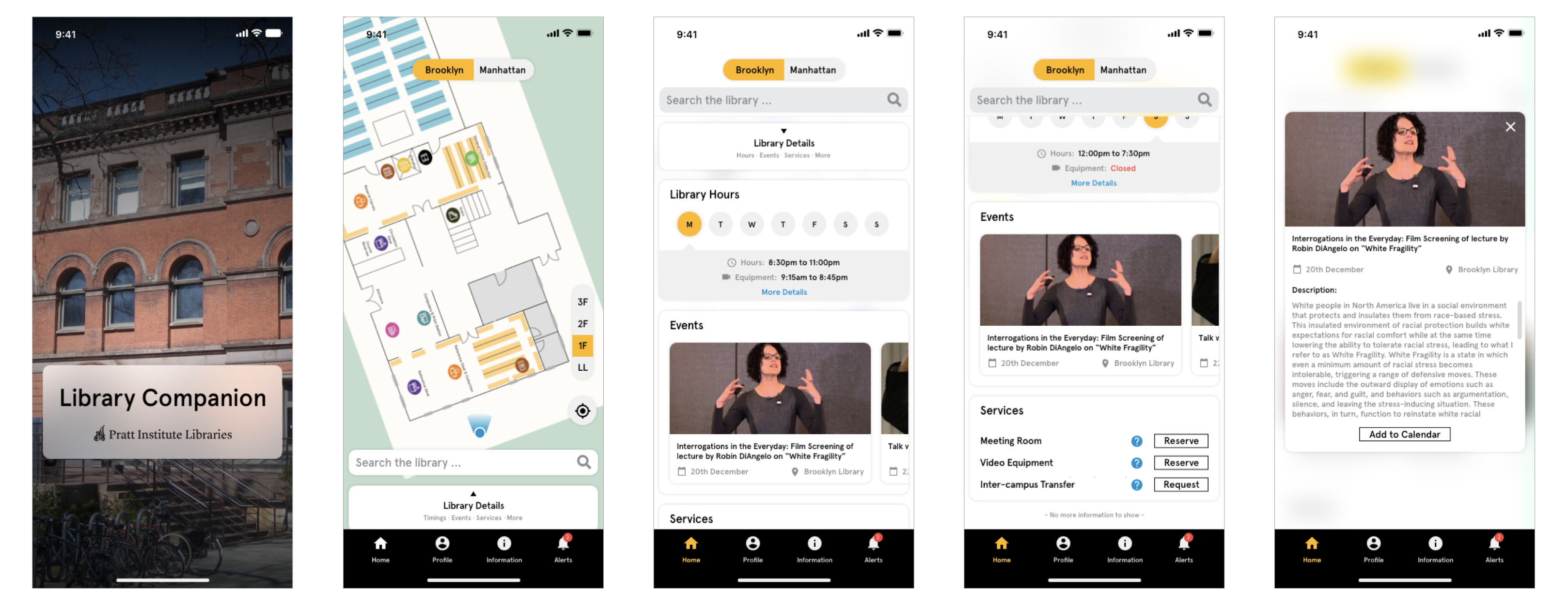
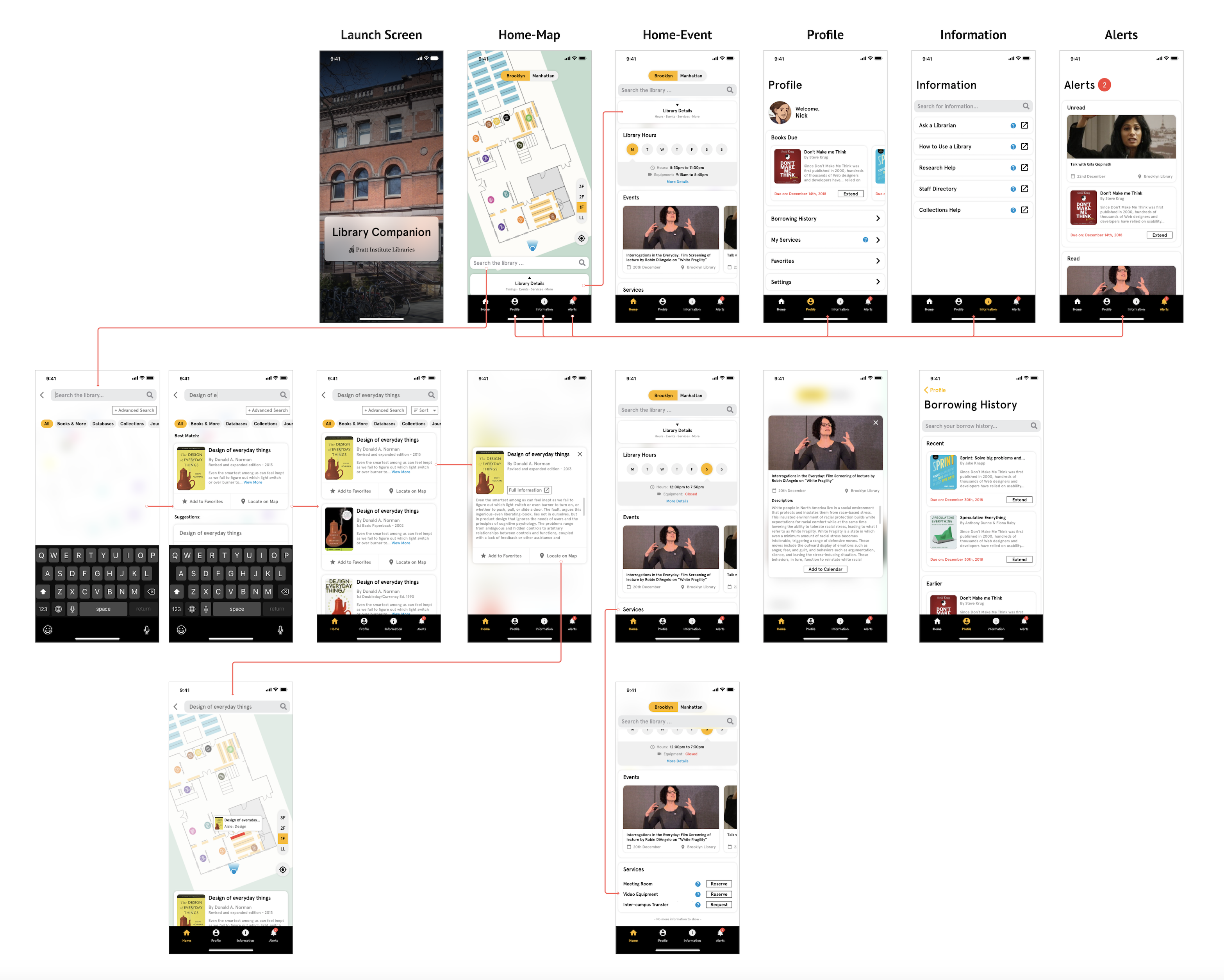
Afterwards, we finalized our prototype based on user and stakeholder feedbacks. The app will display a library map based on user’s location once they open the app. Users also have the options to switch between Brooklyn and Manhattan campus, among different floors. On the homepage, users can also start searching the book, or view the library hours and events.
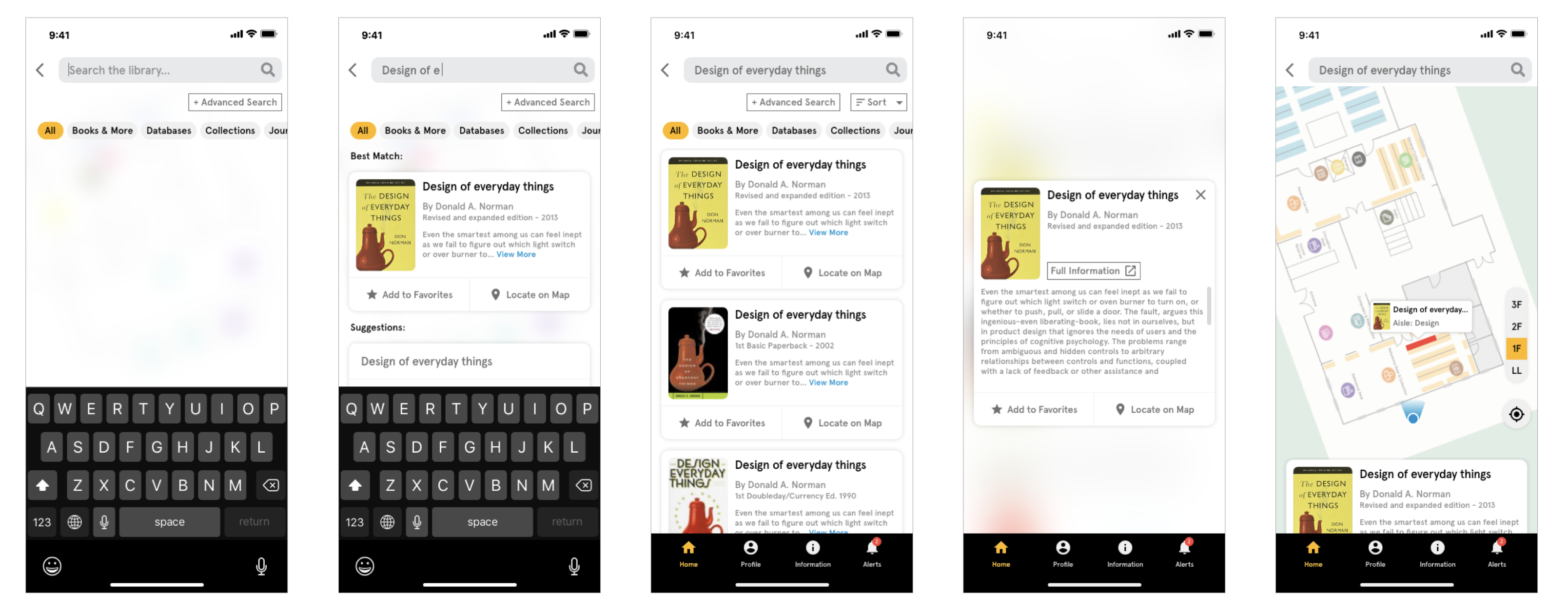
Users will be able to bookmark the book they like from search result, and the best part, locating the book on the map. Once users tap “locate on map“, the map will highlight the book shelf the book is in.
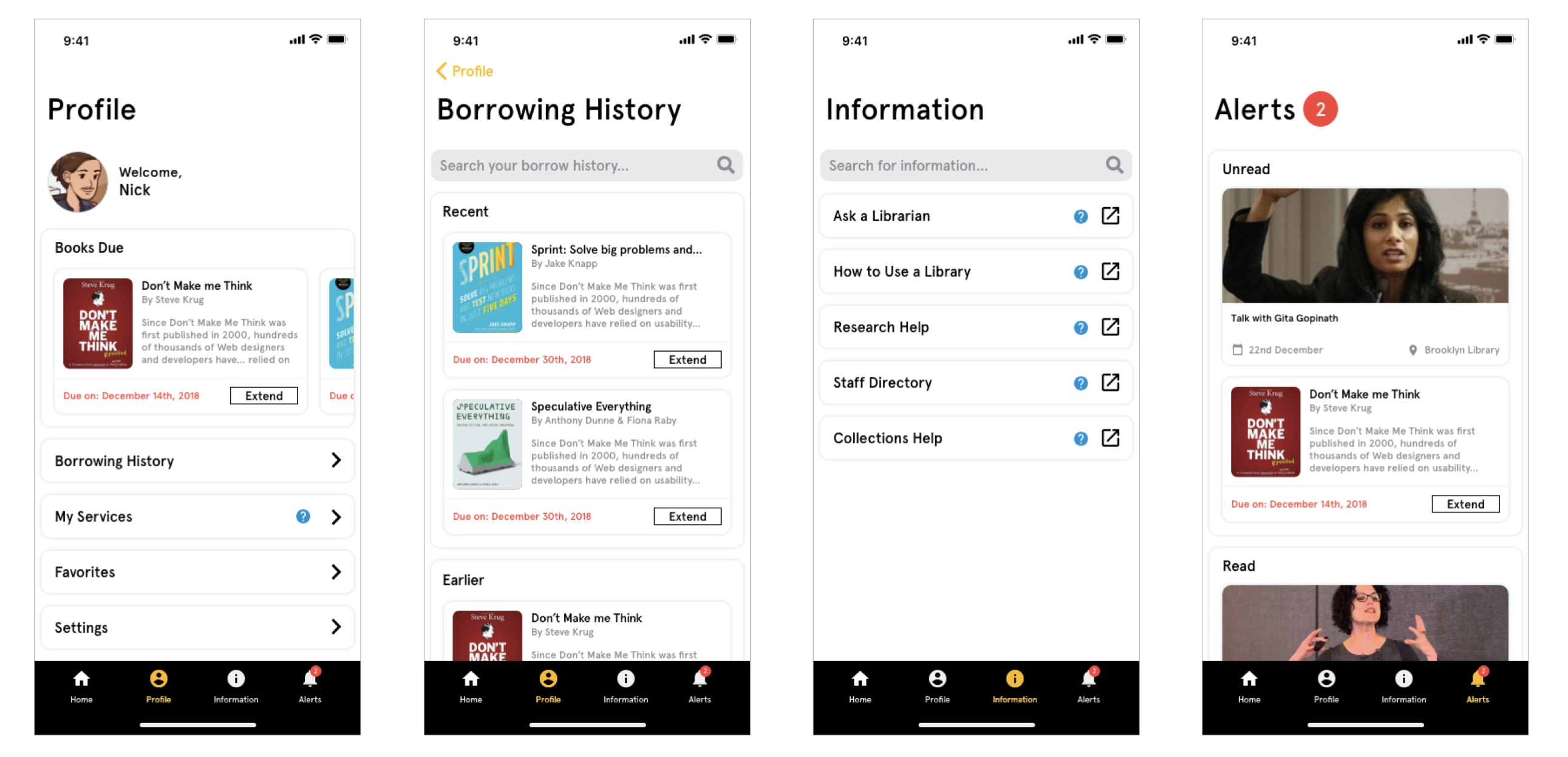
Besides, the app equips with Profile and Alerts functions, where users have a borrowing history that only stored at their local phone due to security and privacy issues. It will also remind users of the due date of returning book and offer option of extending the borrowing directly on the app. If users come across any questions, there is a Information section listing all the useful links to librarians and other help resources.
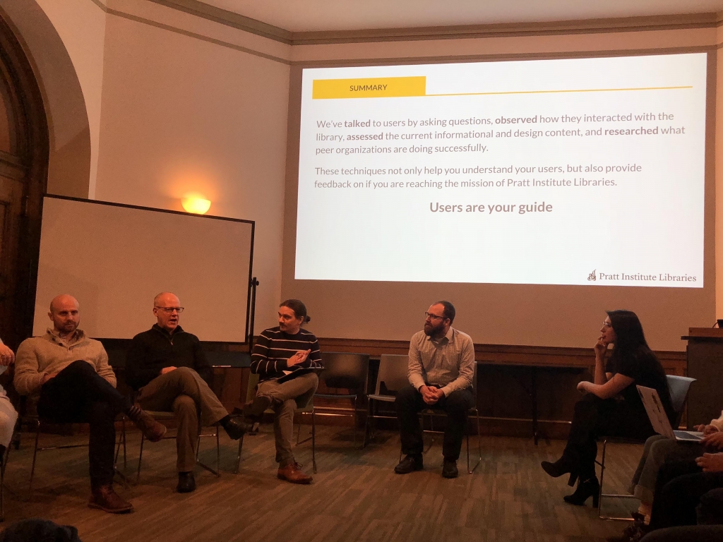
At the end of the project, our team presented the proposal with our stakeholders, who are very satisfied with our deliverables, considering it’s a great direction for Pratt Library to improve its user experience. We will wrap up the project and deliver the proposal along with other supporting material to the librarian team.
Main user flow
Conclusion & learning
It’s a very unique experience working with 15 other researchers and designers. We have the advantages of conducting many in-depth users researches, which help us better understand the problems and user expectations from different angles. Designing a map to improve the in-library is also an interesting process. We want to empower and assist users in the best way, while also want to keep the app light enough to build and maintain for the current librarian team. At the same time, part of the large design team was also working on redesigning Pratt Library websites, so we also need to coordinate with them to make sure there are clear differences between the mobile website and the app.
Throughout the process, we have no doubt learned a lot about how a library works and what users care about library services. It confirms again, as a User Experience Designer, we should always listen to the feedback of users and stakeholders. Users help us design a product tailored to their need. Stakeholders keep us designing in the right path, within constraints and being practical.